-
Bristol Boxing Gym
Formed in 1989 by Bristol Boxing legend, Chris Sanigar, Bristol Boxing Gym wanted to update their identity to raise their profile in-line with their reputation. It needed to be bold and focus on the boxing element. With a nod to the classic Lonsdale logo, we hand-drew the stretch ‘boxing’ type and kept the other elements neatly contained in a simple circle lock-up.
-
Invisible Britain
“ This book illustrates a truth we cannot ignore” – Ken Loach
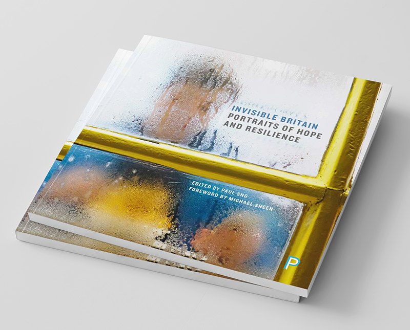
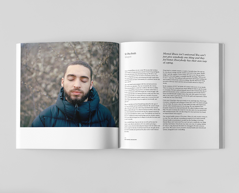
Invisible Britain – Portraits of Hope and Resilience reveals untold stories from people who have been left behind by government policy and austerity. Featuring the work of award-winning documentary photographers, we art-directed and designed this book to powerfully present the people and their words.
-
Public engagement
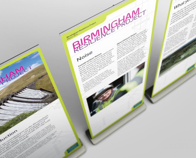
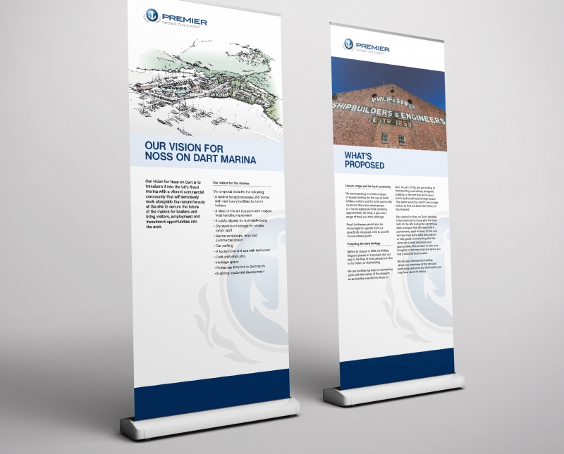
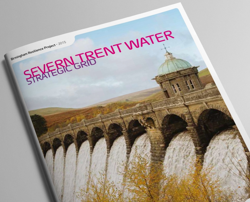
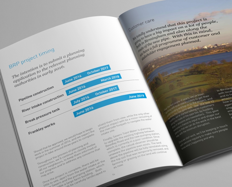
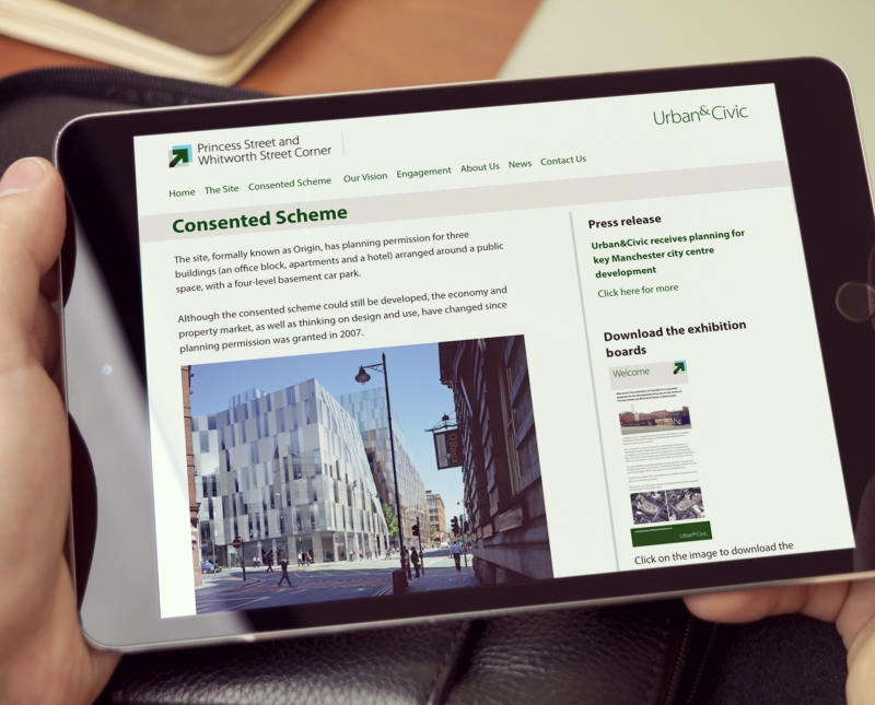
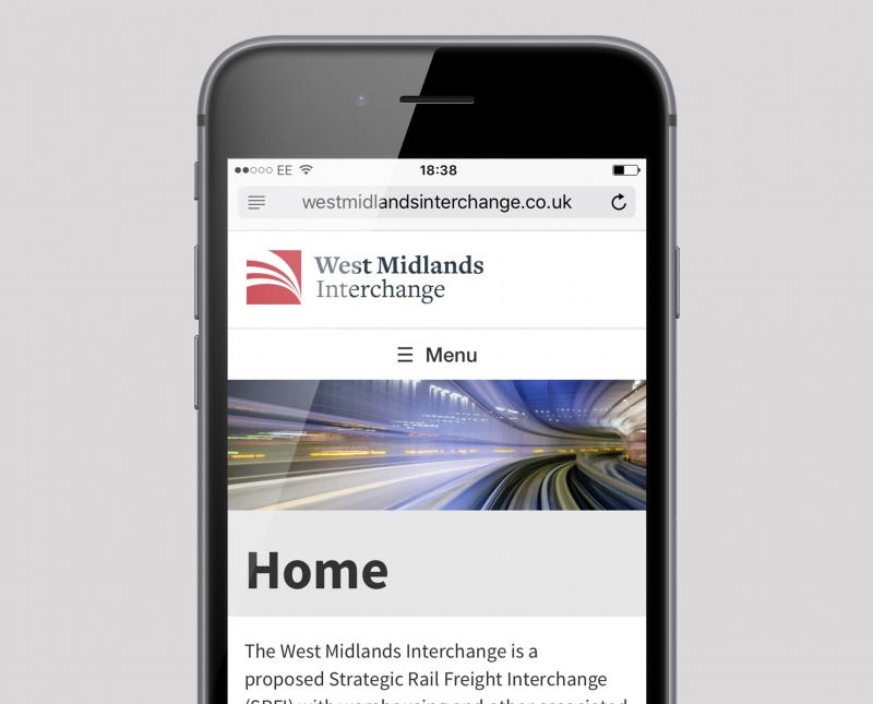
Considered the somewhat tougher end of communications, design for public engagement continues to be a significant part of our work. Producing consultation web sites, public exhibitions and newsletters with the likes of EDF Energy, Waitrose, Scottish Power, Yorkshire Water, Severn Trent, Tata Steel and Devon Wind Power, we have developed a tight and efficient style of working which gets the job done on time and on budget. One flies by the seat of ones pants from time to time, but there’s never a dull moment in this sector.
-
Bristol Distilling Co.
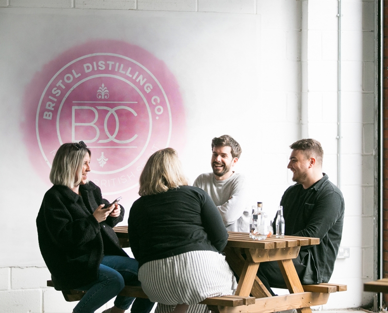
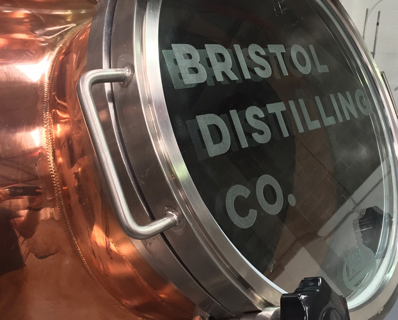
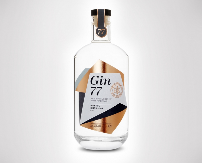
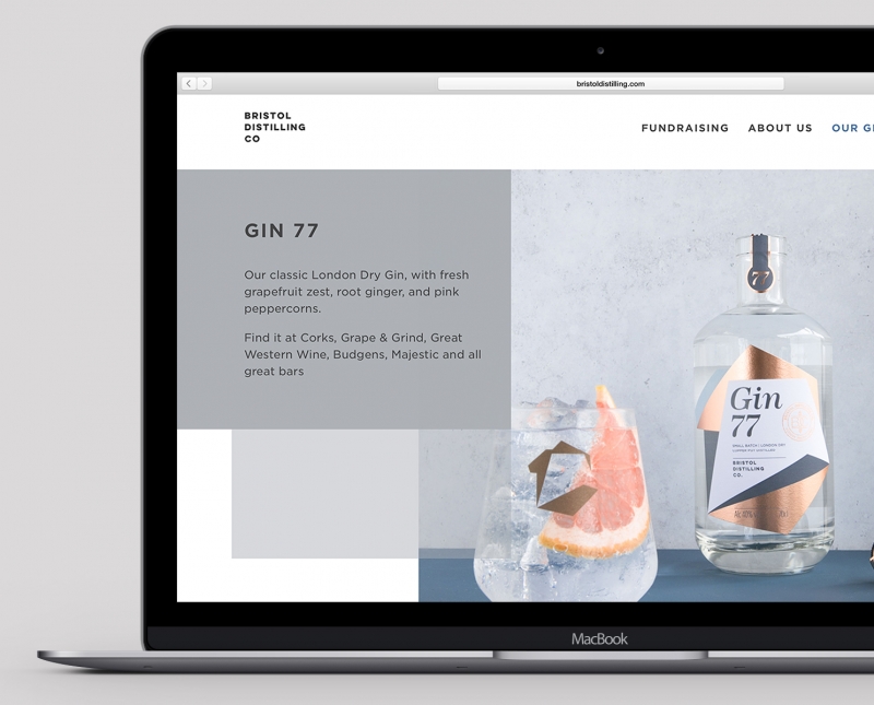
Bristol Distilling Company needed a brand to match their left-field approach to liquor production. We developed a full corporate identity followed by website design and build, social media assets, signage, all aspects of small and large-format print, plus a helping hand in art-direction for the interior of their distillery tap room.
-
Triodos Bank
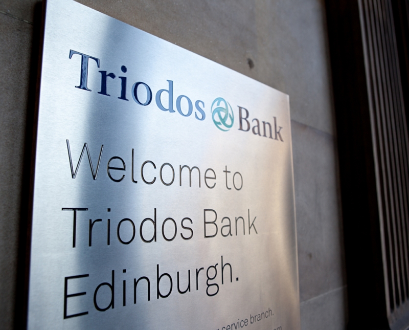
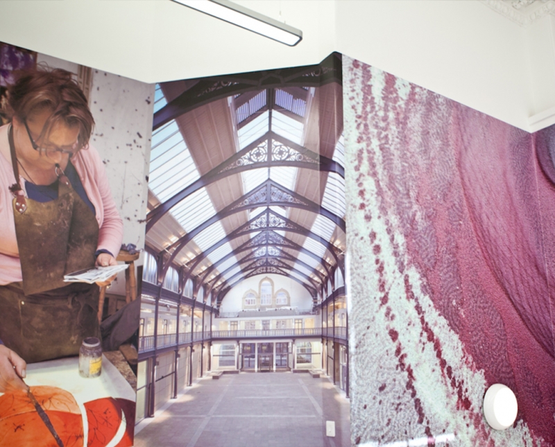
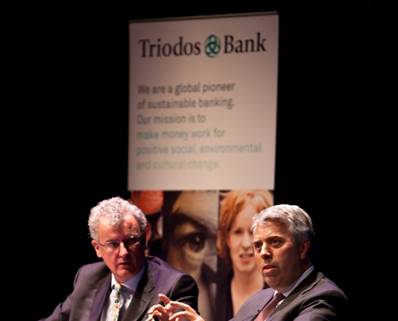
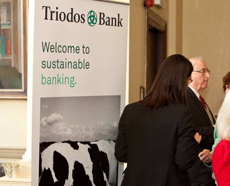
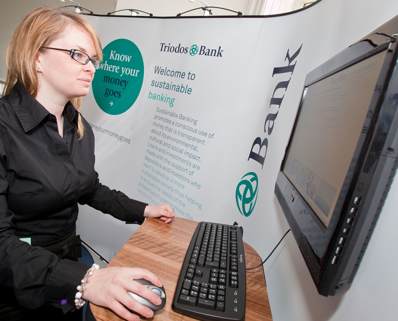
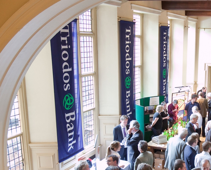
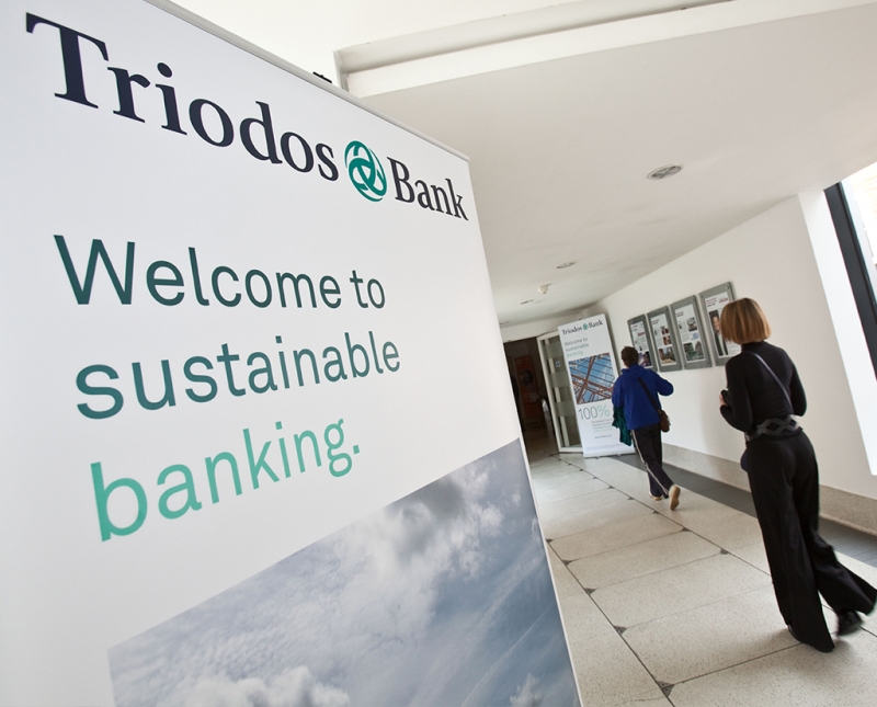
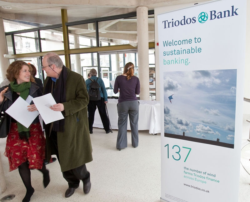
From rolling out brand for both personal and business banking, to giving their Annual Meeting a visual language for the last decade, to web assets, all aspects of design for print plus a hand in their HQ interior graphics – we have covered a lot of ground with the world’s leading sustainable bank.
-
Loungers
It started with one cosy bar on North Street in Bristol, and now it’s heading towards 70 bars UK wide. Loungers wanted us to come up with a clean and adaptable logo; then came the signage, the menus, the ads, the cups and so on.
-
Futures of Work
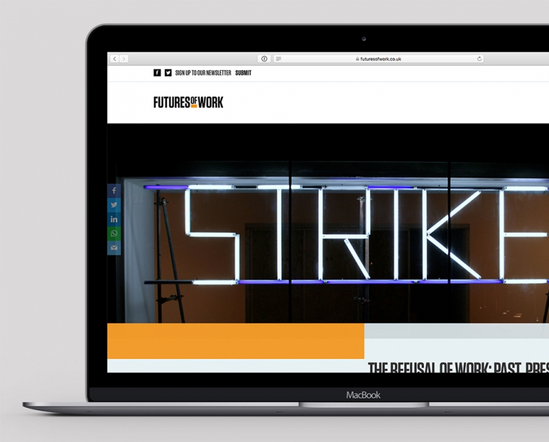
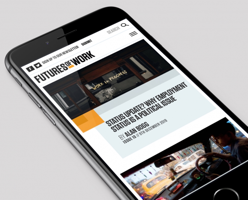
Powered by Bristol University Press, in collaboration with a multidisciplinary editorial team at the University of Bristol, Futures of Work wanted a bold, modern, punchy brand and website to reflect their radical insights into the changing world of work.
-
Empire Fighting Chance
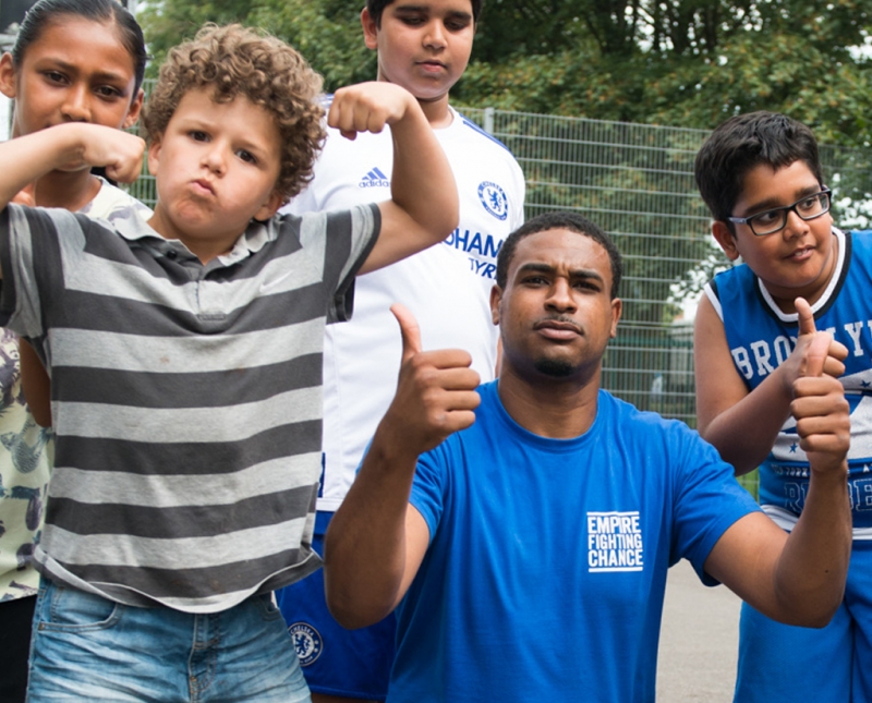
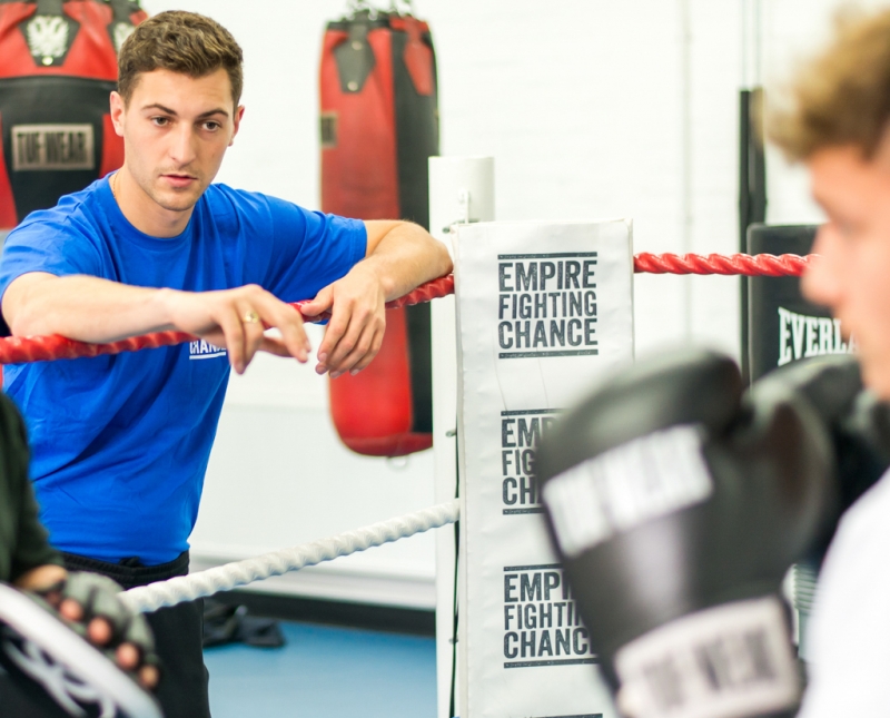
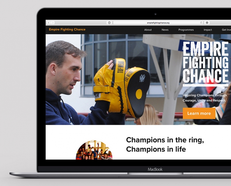
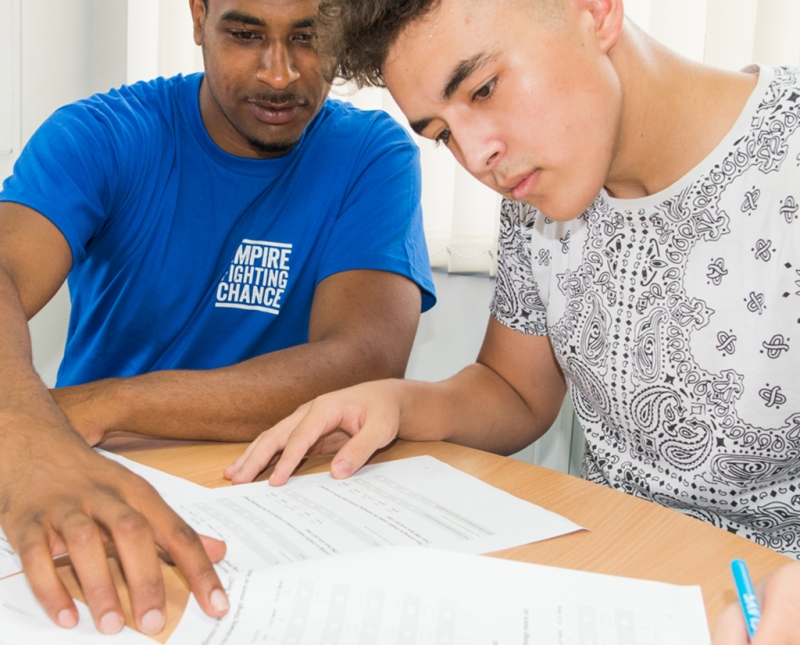
Brand creation, website design and build, social media assets, animation, all aspects of design for print, merchandise, and livery for Bristol-based charity Empire Fighting Chance.
-
Bristol University Press
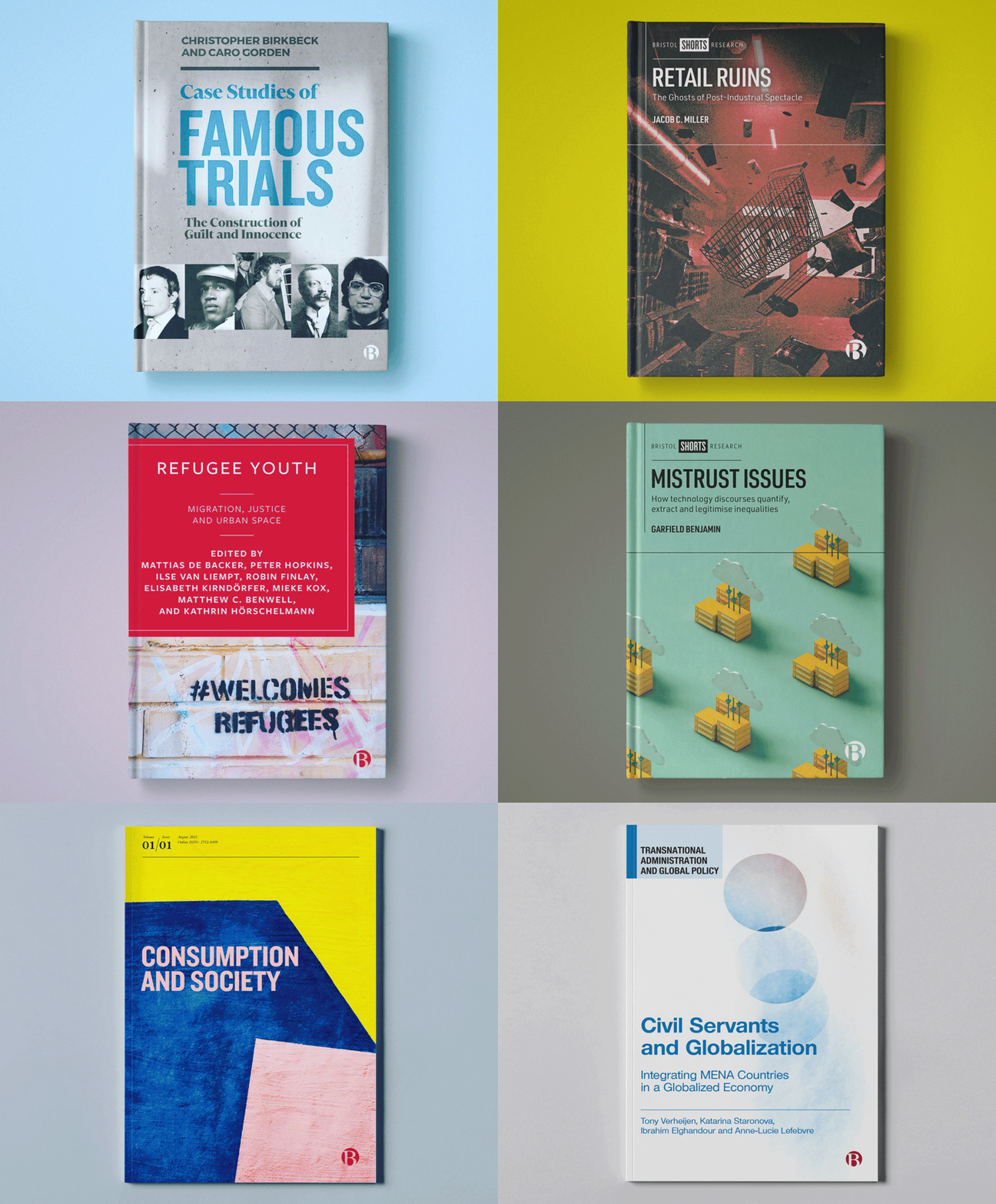
Brand creation, catalogue and book cover design, website design, social media assets, illustration, and exhibition design, for global-leading academic publisher, Bristol University Press.
-
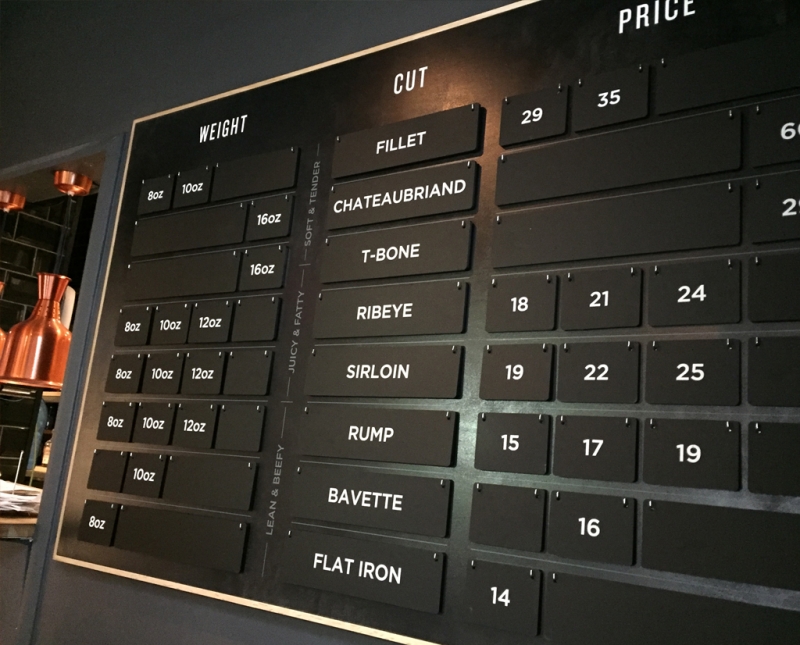
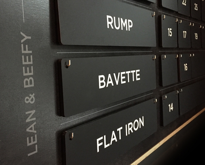
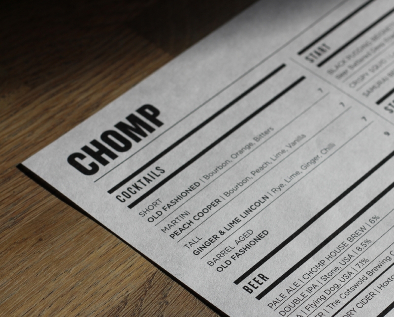
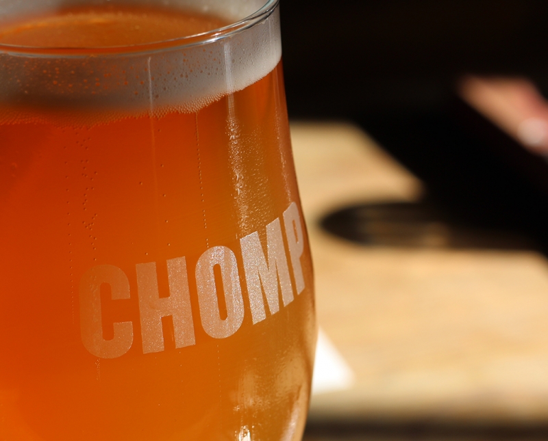
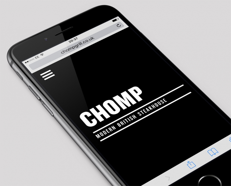
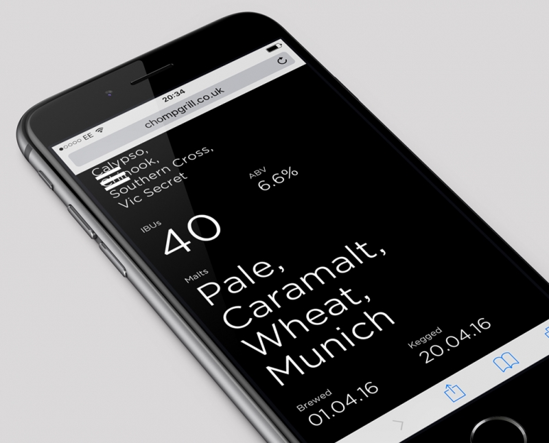
CHOMP
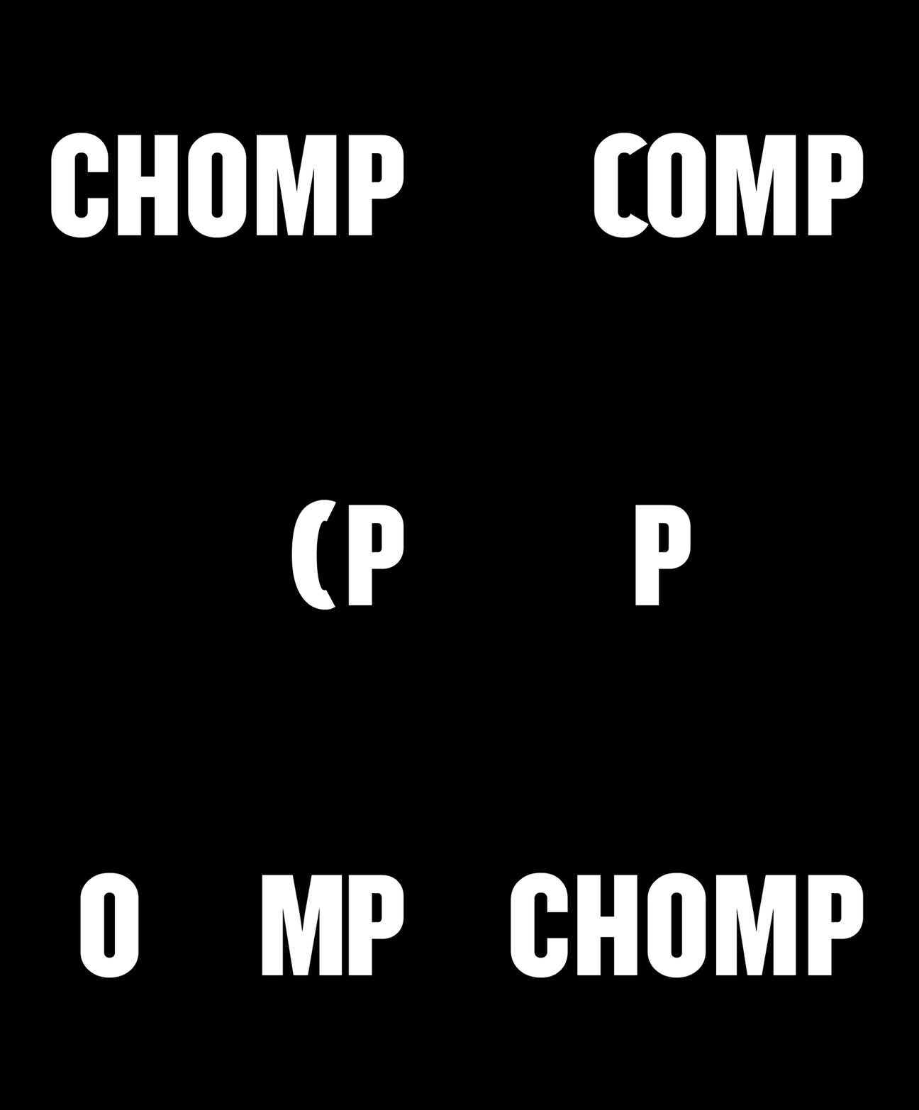
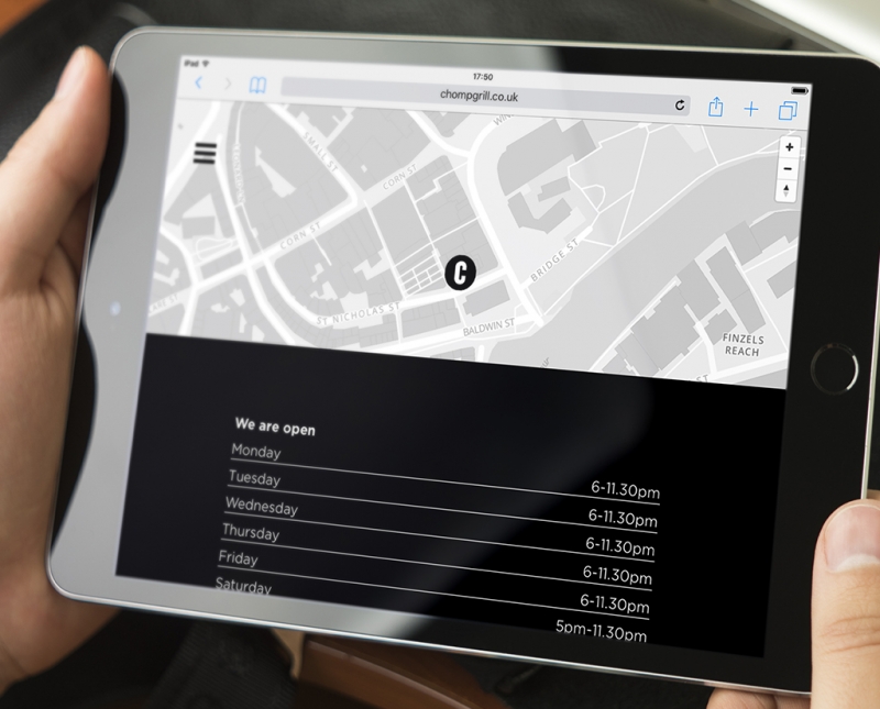
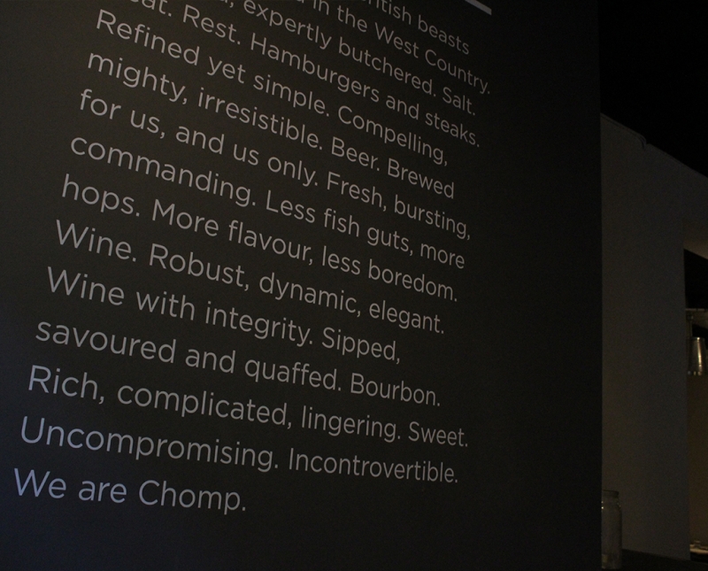
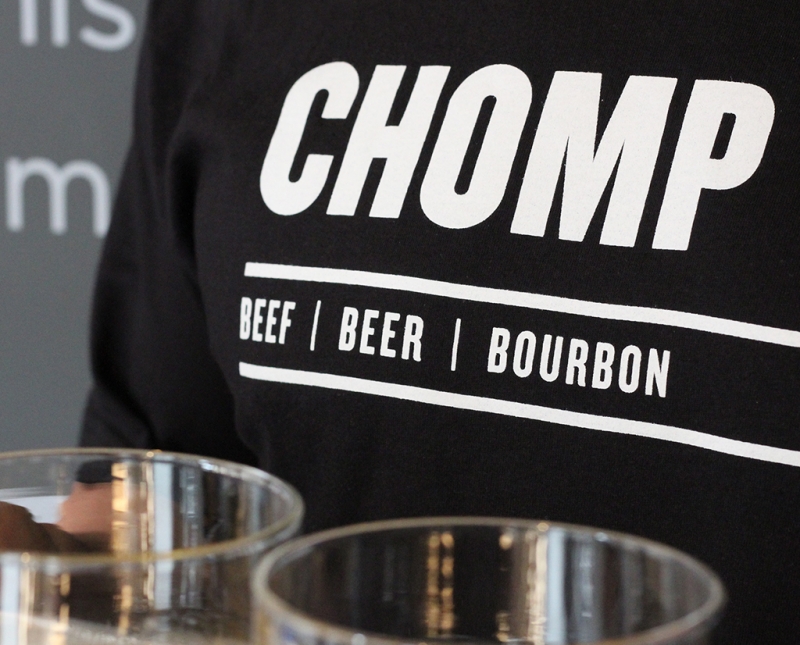
CHOMP are a joy to work with. Bright, engaging and open. It’s a real pleasure developing the brand and seeing the restaurant/s grow and thrive. They serve blinding steak, wine and whiskey. We were asked to develop a clean, sharp, type-led identity. They were very keen on minimal imagery, except a link-out to Instagram from their new site, which serves as a perfect gallery facility. The refreshed identity reflects their brash, no-nonsense attitude to food and drink.
-
Black’s Double Barrel Whiskey
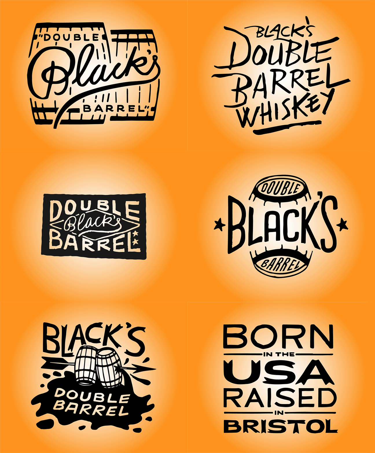
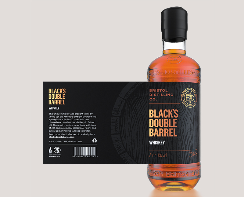
Brand creation, website design update, social media assets, animation, all aspects of design for print, bottle label design, packaging, hand-drawn illustration, hand-drawn type, merchandise, signage, and interior styling for Bristol Distilling Co’s whiskey offering.
-
Publishing
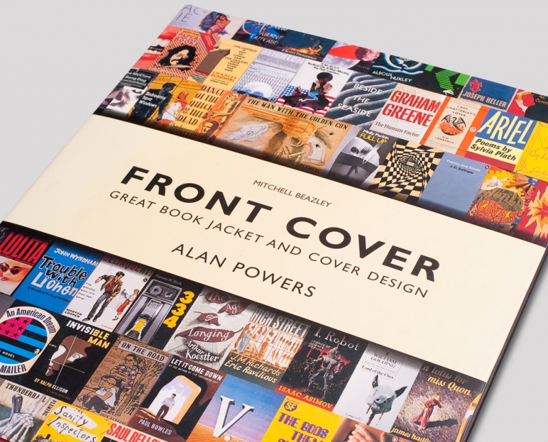
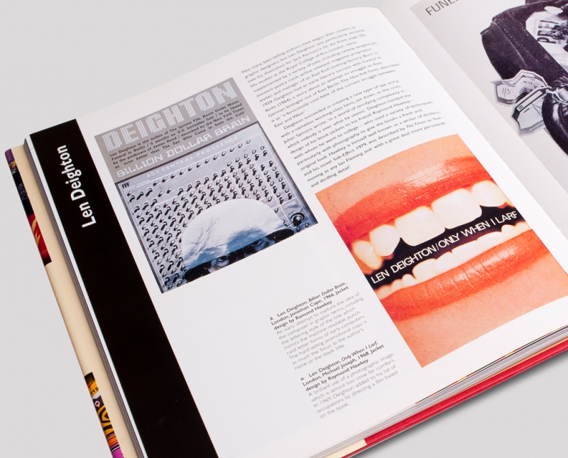
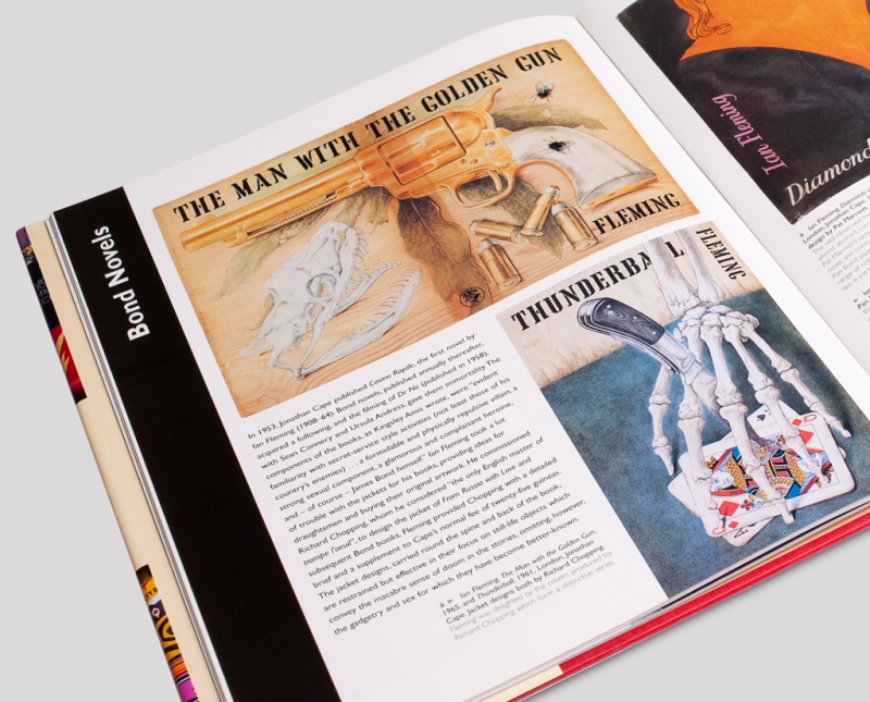
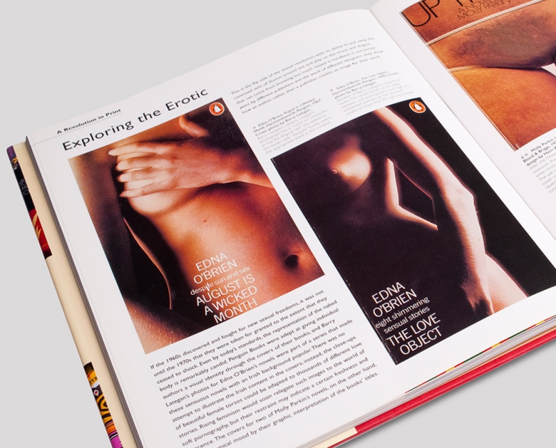
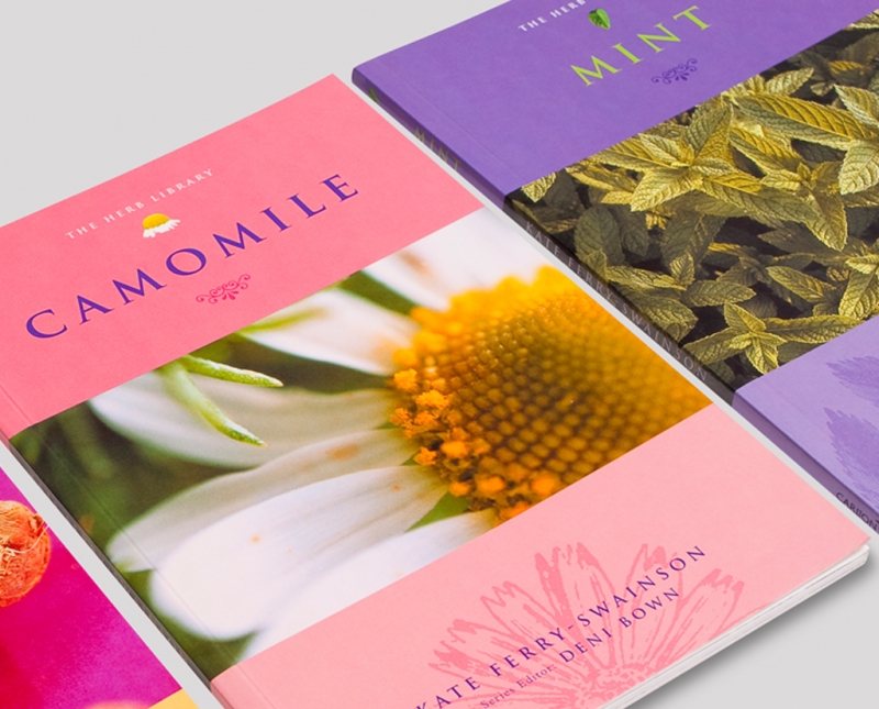
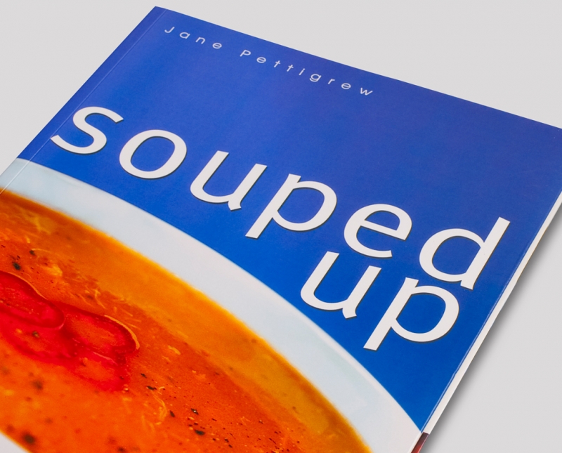
Right from the start of blu inc, nearly 20 years ago, we have enjoyed a close working relationship with some London publishers, getting the chance to design some fantastic books. These projects also give us the opportunity to push the boat out on photography and go a little ‘left field’ with design and layout – glory jobs!
-
Cosmotron
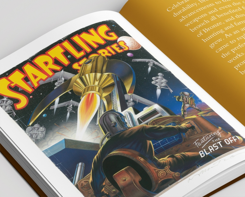
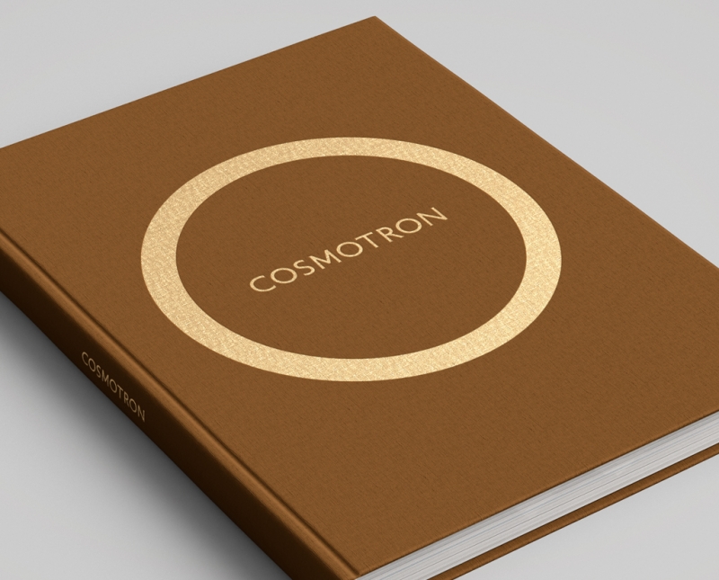
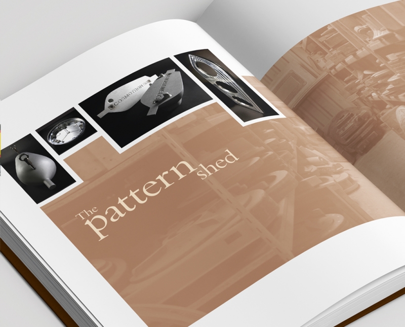
Cosmontron build possibly the world’s best speakers. They are incredible. Standing up to 6ft tall, made of polished bronze (lovingly cast in the UK) and shaped like a rocket from Flash Gordon, the Cosmotron speaker is as much sculpture as it is hi-fi. We have worked on brand development, operation manuals, website and an introduction book.
-
Flatcappers
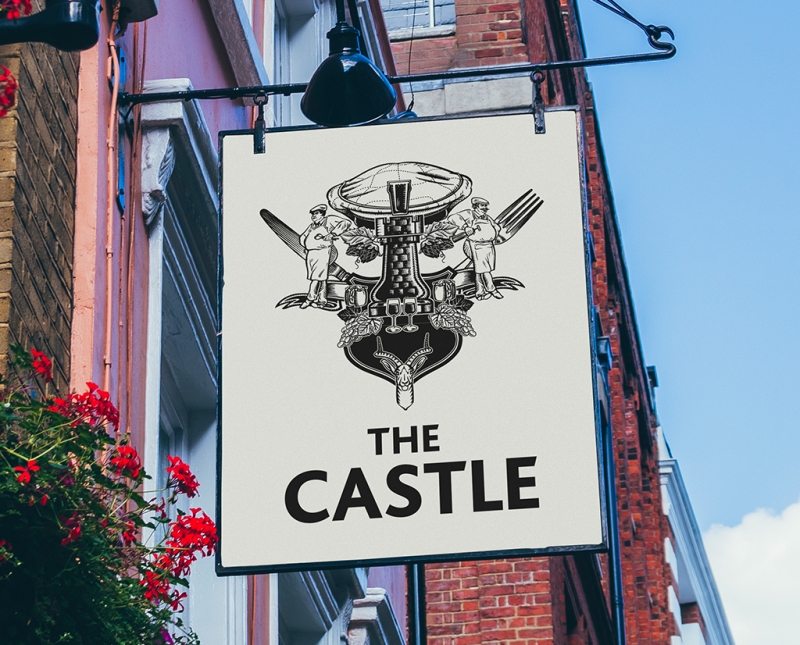
Flatcappers pubs wanted to stand out from the crowd without looking to serious. We developed a series of seemingly high-brow, coat-of-arms style identities. Closer inspection reveals that they are built up with light hearted elements. We then took the new identity and helped with the nut & bolts of dressing the pubs internally and externally.
-
Policy Press
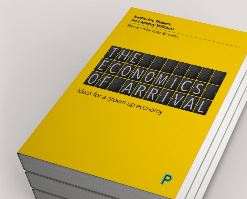
Policy Press publishes work that seeks to understand social problems, promote social change and inform policy and practice with a key aim to improve the day-to-day lives of people who need it most. As an imprint of already established client, Bristol University Press, we were subsequently asked to design key Policy Press book covers.
-
Triple B
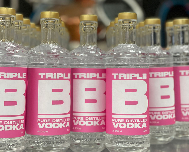
Brand creation, website design update, social media assets, bottle label design, illustration, merchandise, and interior styling for Bristol Distilling Co’s vodka offering.
-
Dogs On The Streets
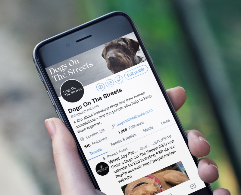
Brand creation, social media assets and print for Dogs On The Streets – a film about homeless dogs and their human companions, and the people who help to keep them together.
-
Mountaineering Scotland
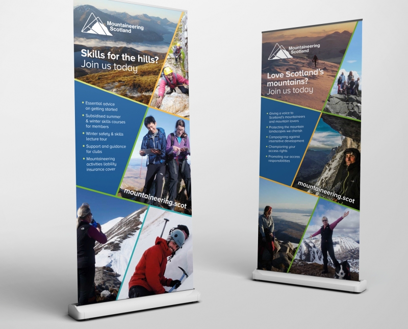
Mountaineering Scotland put the redesign of their identity out there as a competition. Not normally an agency that enjoys the arena of “my little Jonny drew this with his face using the mud of Ben Nevis, so he should win”, we love the outdoors and decided that it was worth a shot. We won, which was nice.
-
Handwriting Bristol
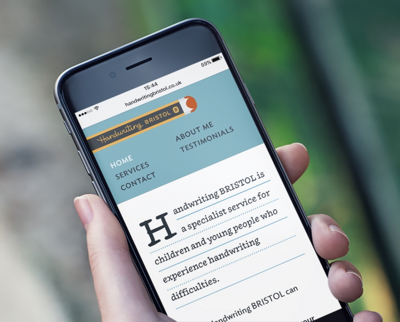
Brand creation, website design and build, and social media assets for Handwriting Bristol – an organisation helping children and young people who experience handwriting difficulties.
-
77 Gin Liqueurs
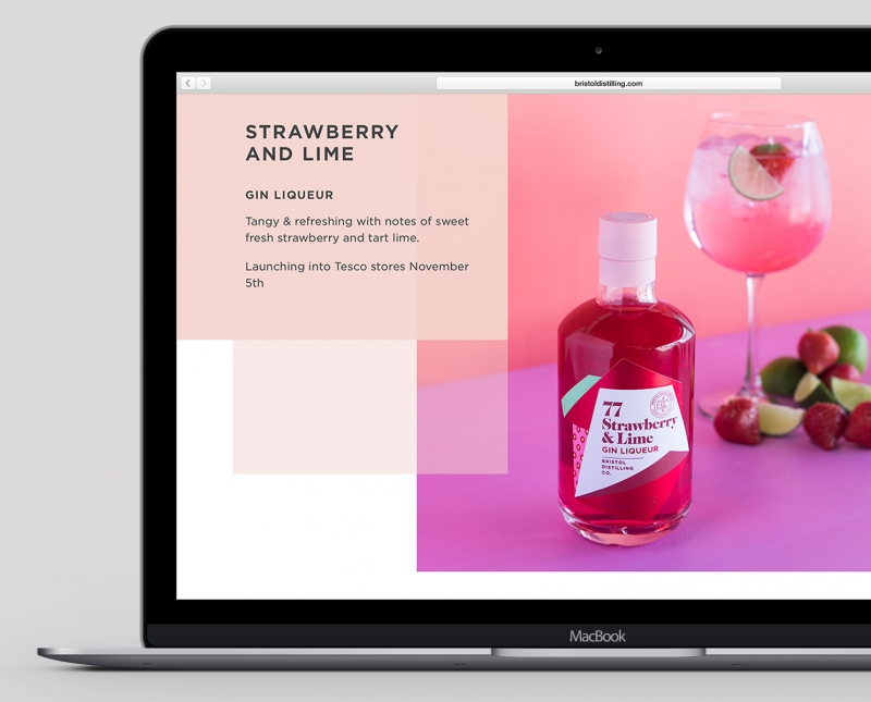
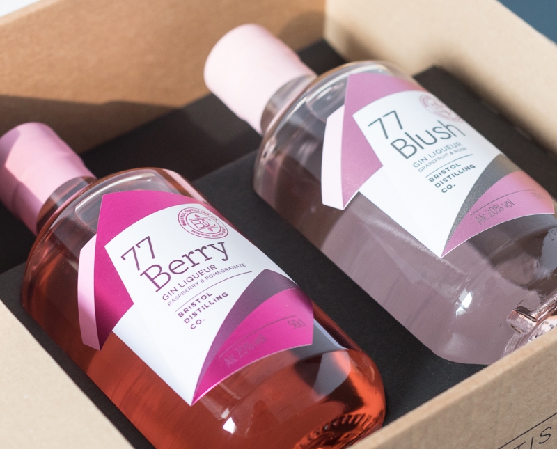
Having had success with their signature spirit, Gin 77, Bristol Distilling Co developed a range of flavoured gin liqueurs. We art-directed and designed a suite of bottle labels and associated graphics, merchandise, advertising, social media assets and a web site update.
-
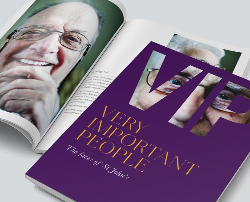
St John’s Bath
-
Writers
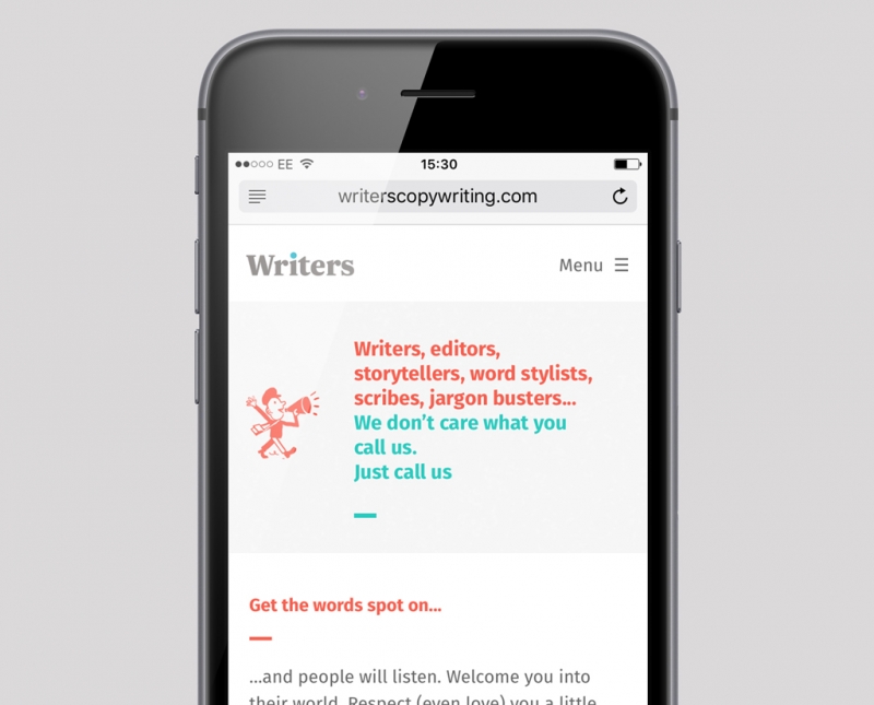
International copy firm, Writers, needed a range of design work, from a logo refresh and website design and build, to icon design and illustration. Having no brand imagery, except for some photos of their team, we enlisted Bjørn Lie to illustrate a suite of images, while we created a small set of icons to help distinguish sectors on the website.
-
Stump Brothers
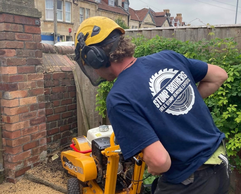
Brand creation, illustrations, livery, merchandise, print and social media assets for newly established arboriculturists, Stump Brothers. The best company naming session we’ve had in years.
-
Gin 77
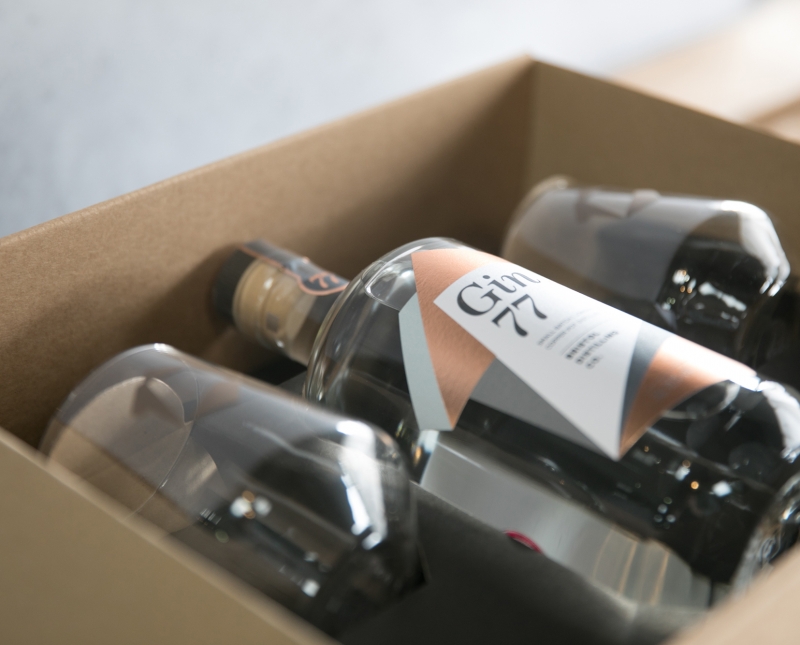
Covering the family of gin and gin liqueurs at Bristol Distilling Co, we worked on brand creation, label design, packaging design, new product development, website, social media assets, marketing collateral, merchandising and all aspects of print for this fast expanding, Bristol-based drinks company.
-
Fenix Energy
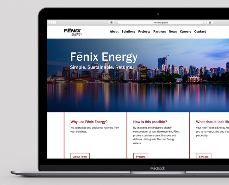
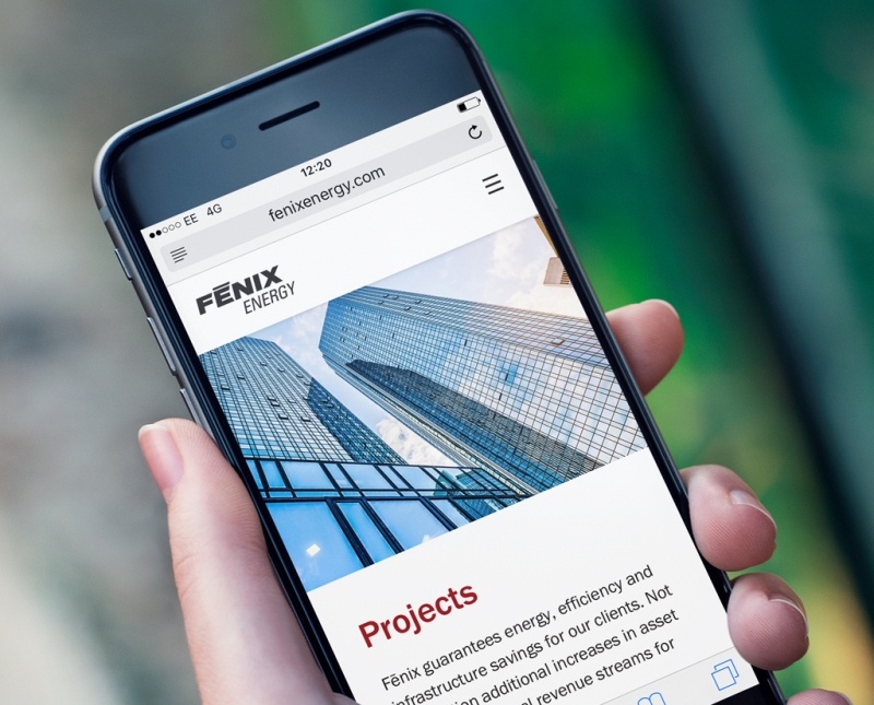
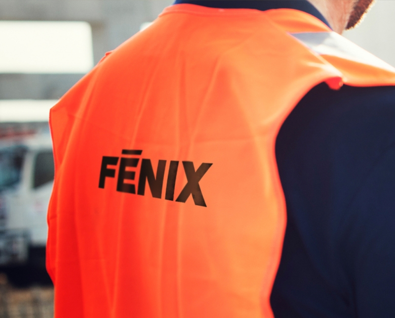
Fēnix Energy ‘delivers Thermal Energy Assets’ across North America. It’s a complex sale and needed a clean, uncluttered website to get their proposition across in a digestible way. Workwear and presentation template concepts were also put forward.
-
The Burger Joint
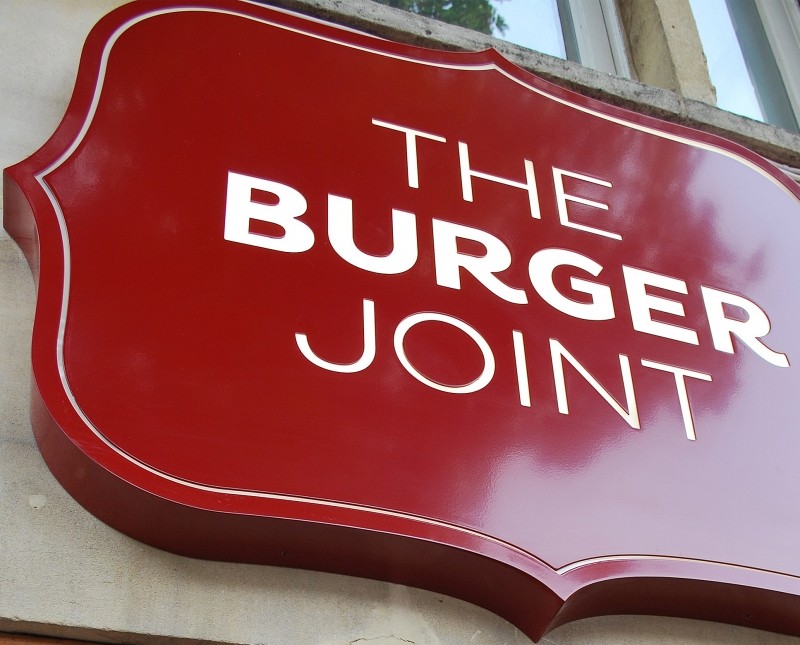
The Burger Joint needed a brand to match it’s vibrant and confident offering as one of the first gourmet burger chains in Bristol. Fast-forward a few years, and it’s been voted best burgers in Bristol and receives media praise for sourcing its high-quality ingredients locally, and producing a delicious patty.
-
Shanks
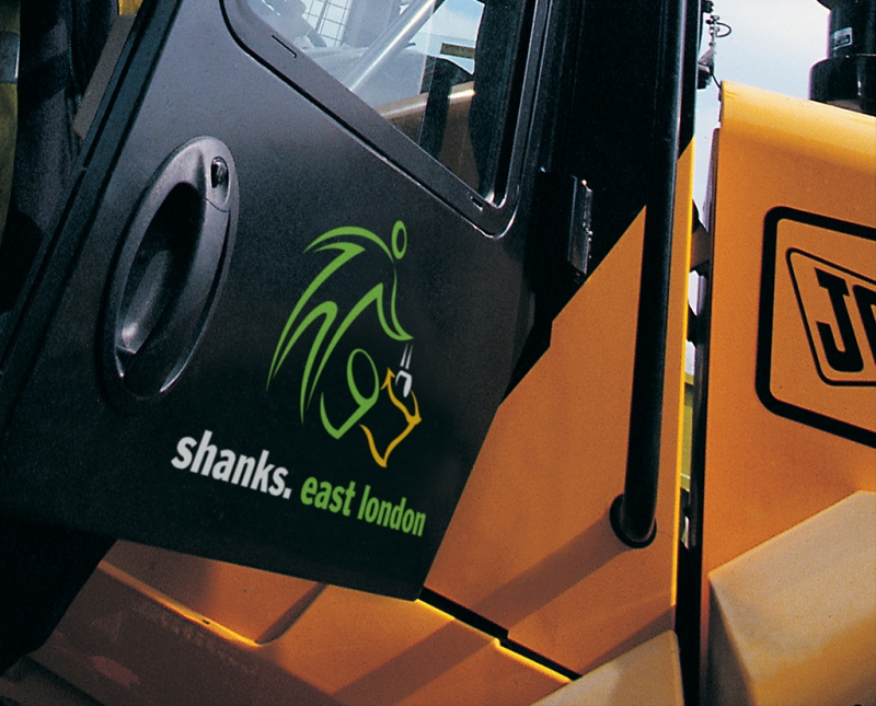
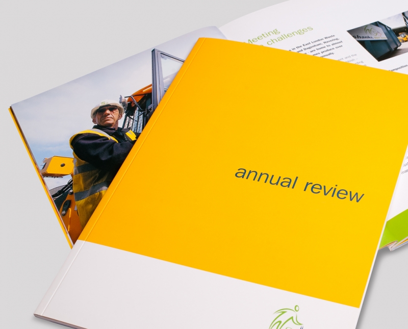
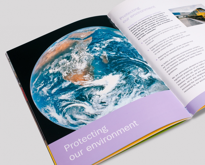
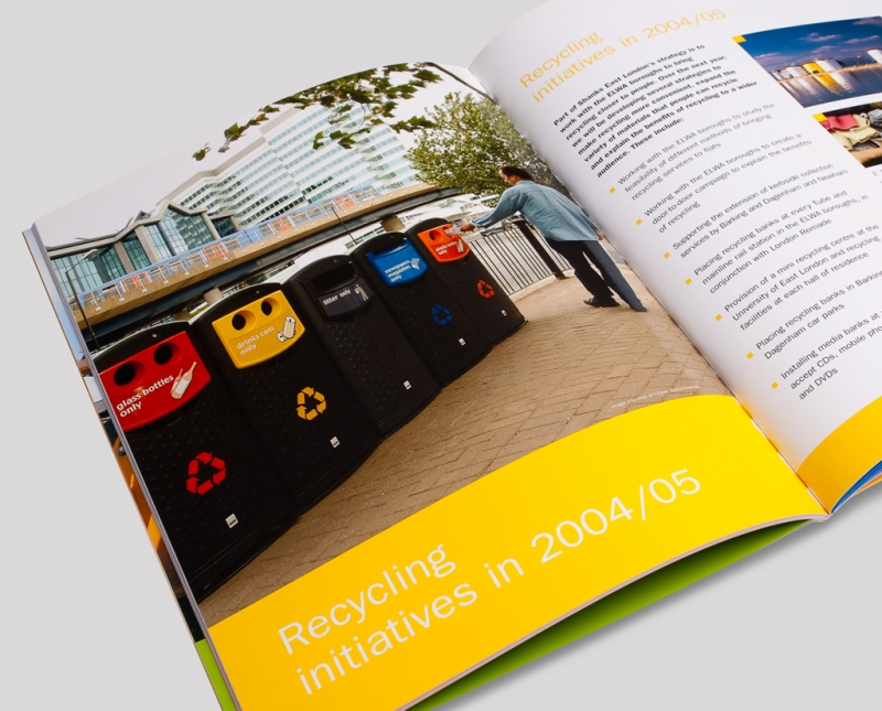
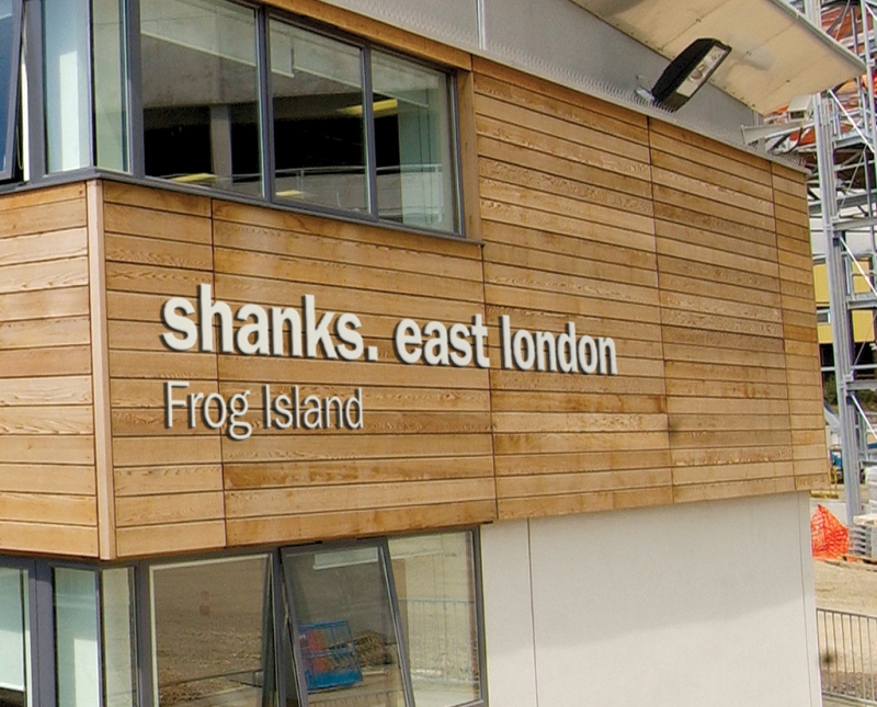
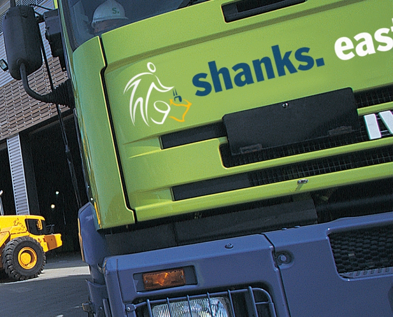
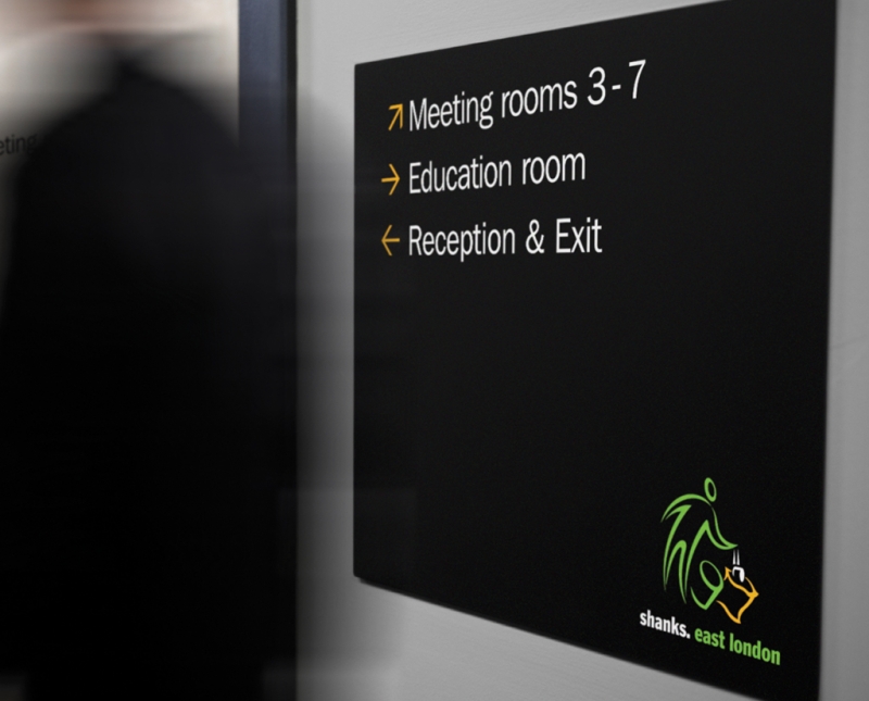
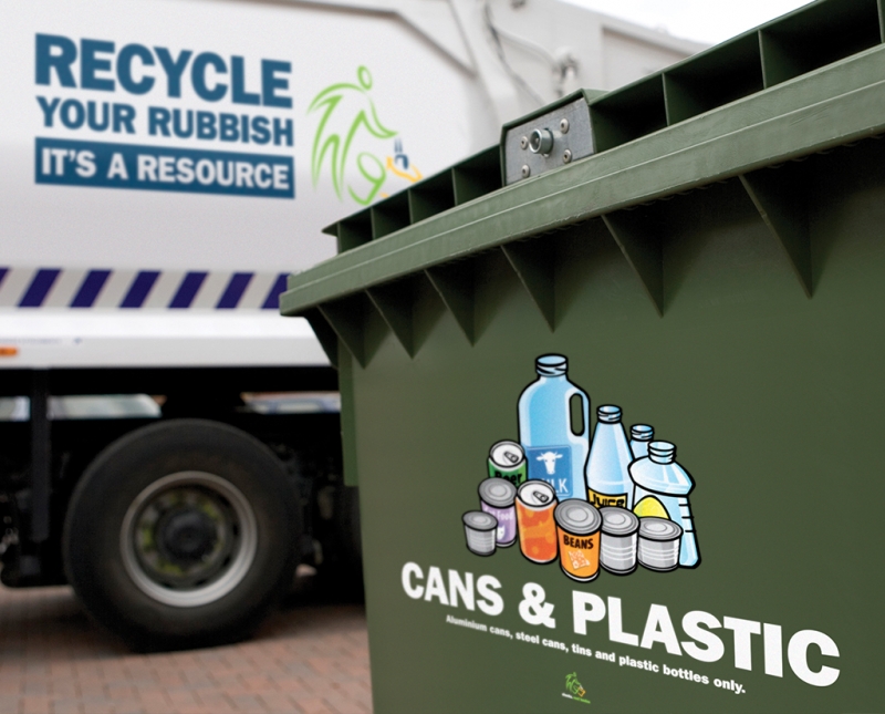
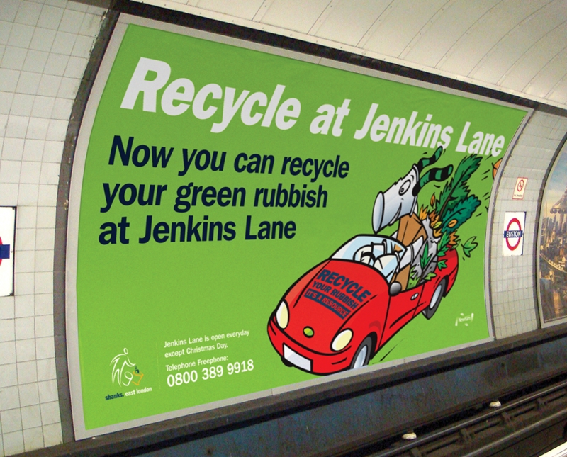
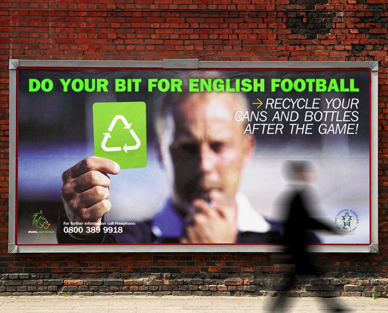
With the daunting task of trying to increase recycling rates in East London, Shanks asked us to design a campaign identity that communicated the ‘act’ of recycling to a mainly non-English speaking audience in the East London boroughs. With lots of stake holders to please, managed to steer them towards a simple, bold and clear logo which was rolled out onto a wide range of material including livery, signage, advertising, billboards and annual reports.
-
GABV
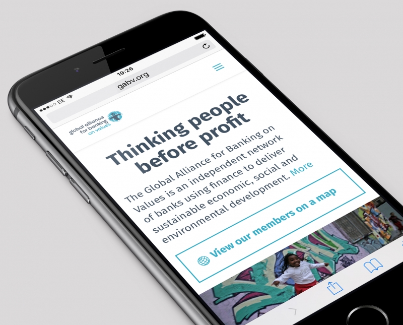
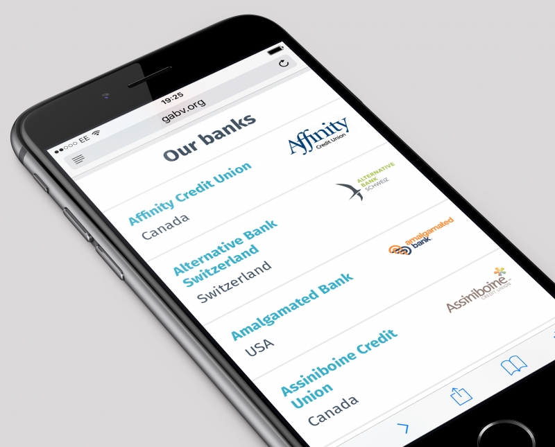
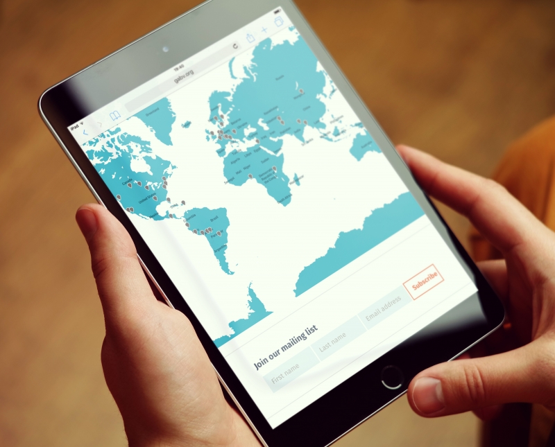
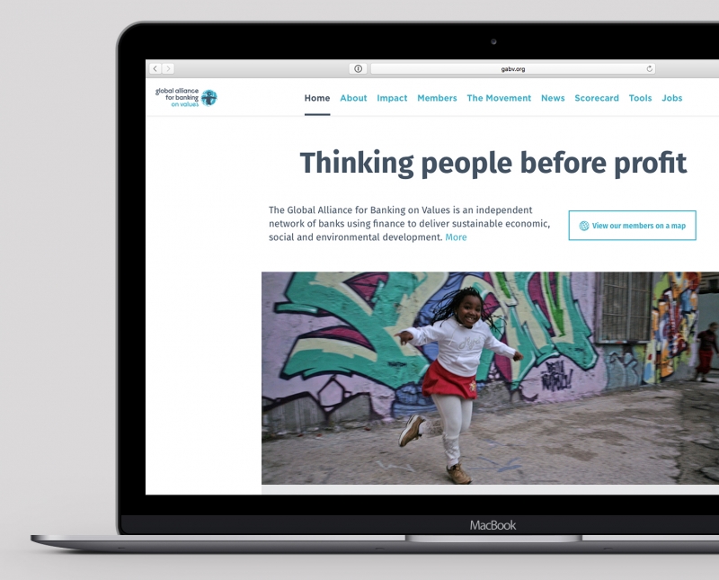
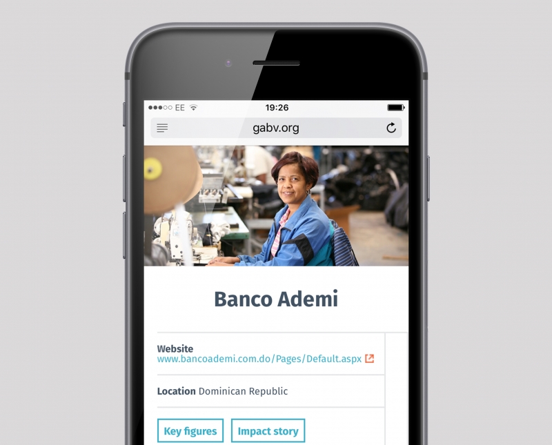
The Global Alliance for Banking on Values (GABV) is a network of sustainable banking leaders from around the globe. They asked us to design a web site to showcase their collective work. Removing the visual clutter from the previous version has produced a site that focuses on the message, navigates intuitively and provides easy access to member facts and figures.
-
Exhibitions and large format
-
Ben Salisbury
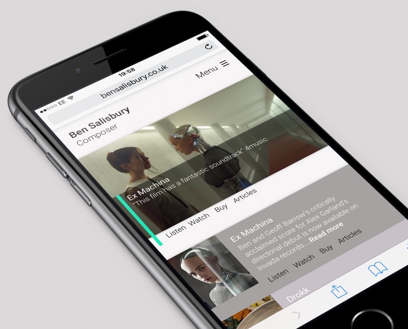
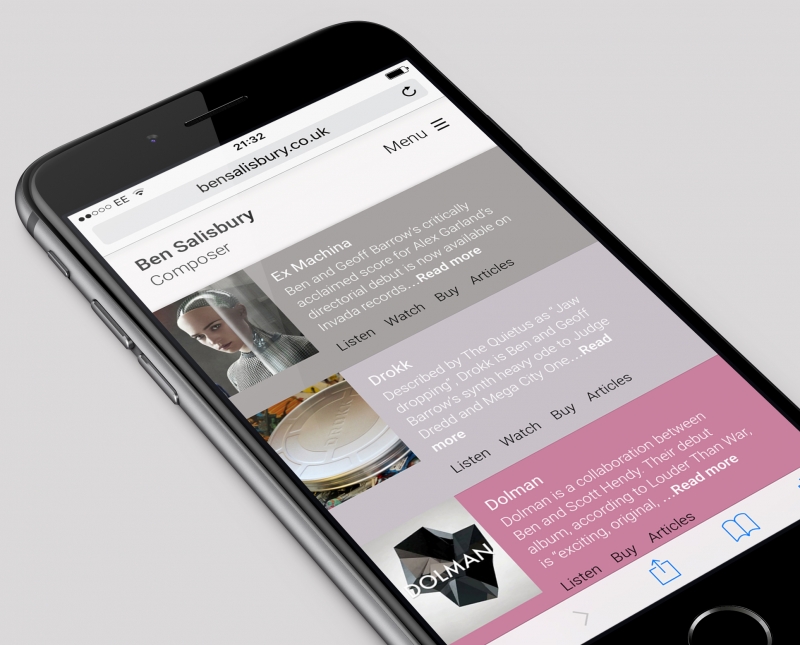
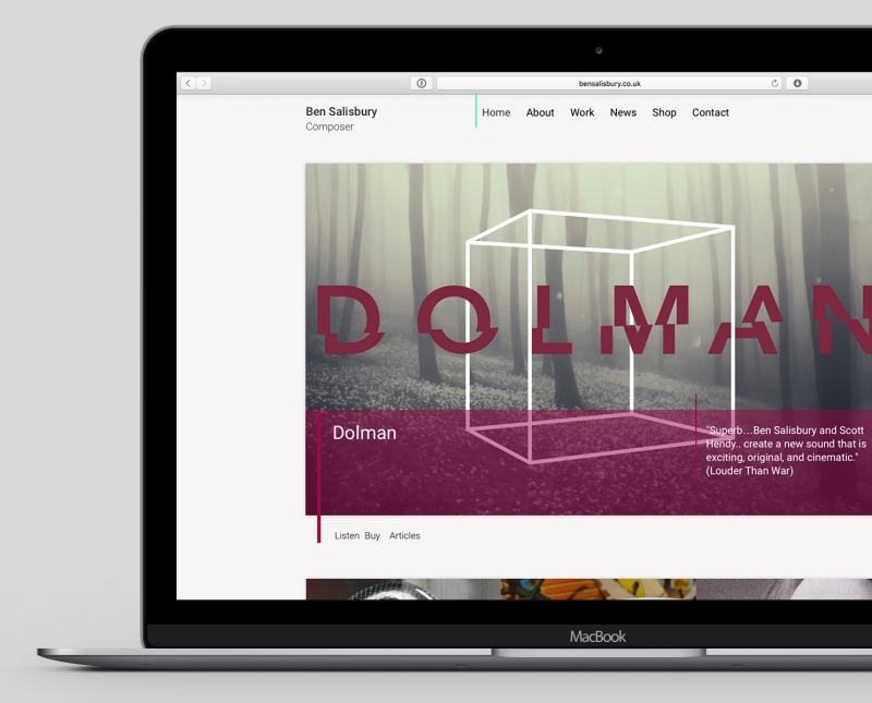
Emmy nominated composer, Ben Salisbury, best known for his scores on feature films such as Ex Machina and Free Fire (with Geoff Barrow) wanted a clean, modern and minimal site that gave him the ability to showcase his audio talents in a visual way.
-
Sort it*
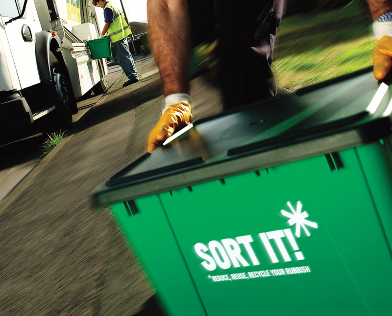
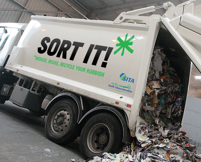
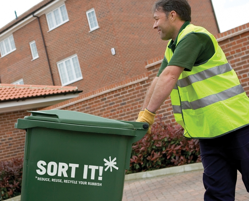
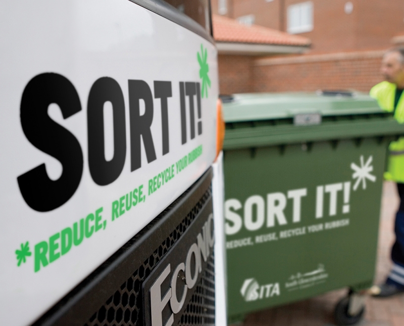
South Gloucestershire needed an identity to brand their new recycling campaign. Firstly, we named the campaign and then designed a direct ‘call to action’ logo and brand that can be seen on everything from the web site to livery to recycling bins. Big and bold – it gets the message across.
-
Anna Gravelle
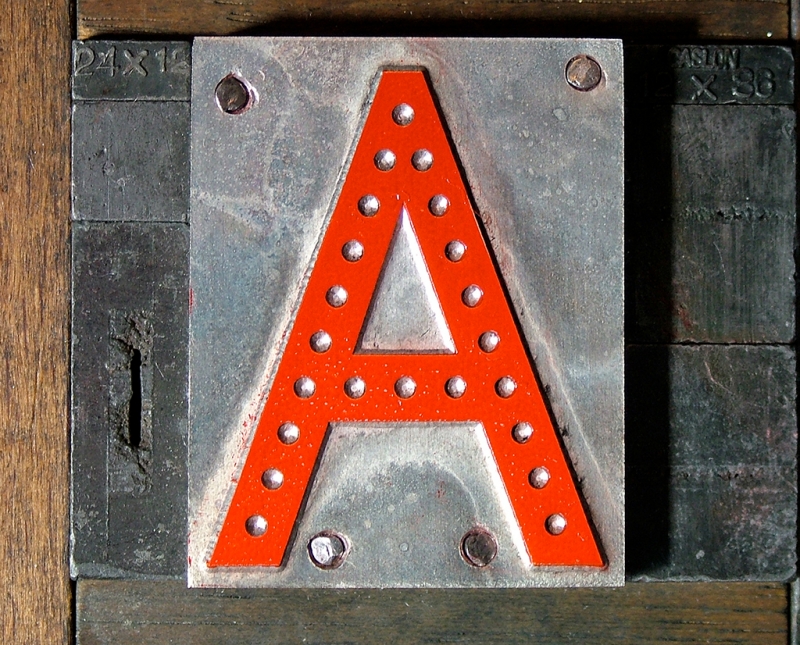
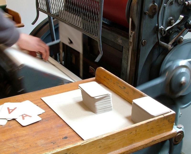
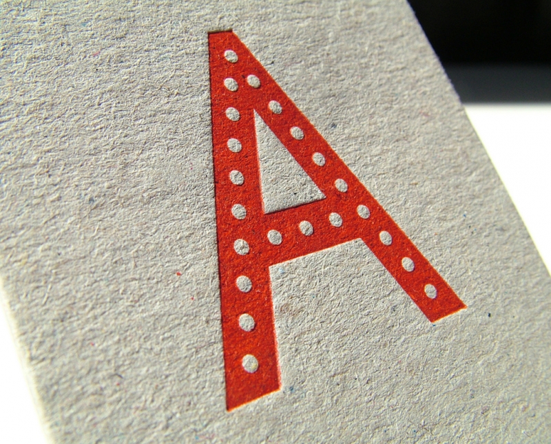
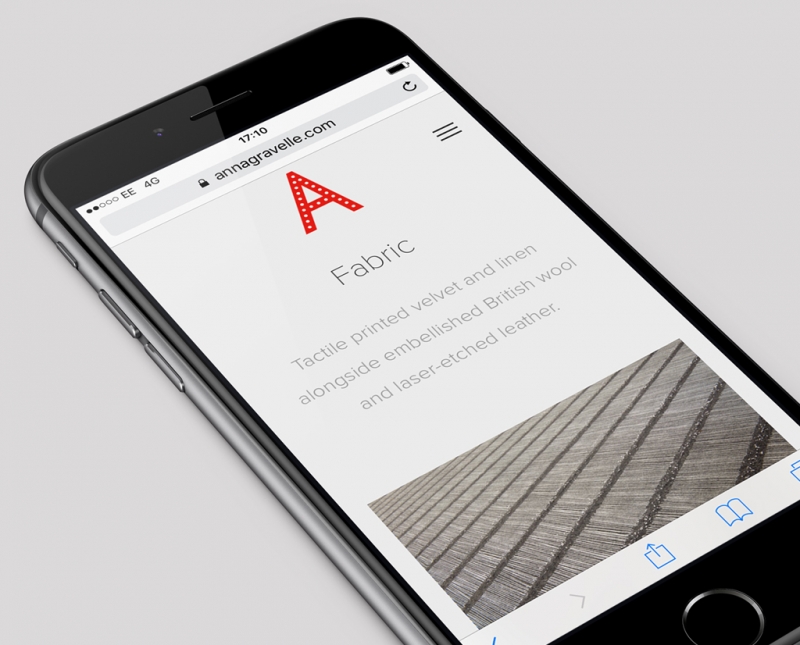
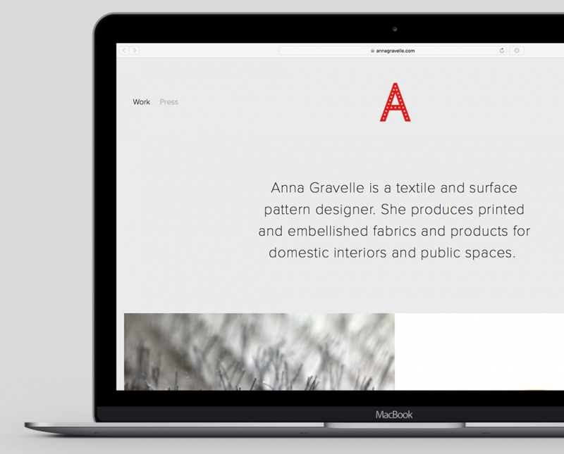
Bristol based textile designer Anna Gravelle wanted a bold, simple portfolio style website. We designed her identity a few years ago – it still worked well on the new website. The tactile process and result of Anna’s letterpress printed business cards (printed by the wonderful Typoretum), on rough grey board, was important to her, as her textiles are like stroking a huge, hairy back.
-
Coleman
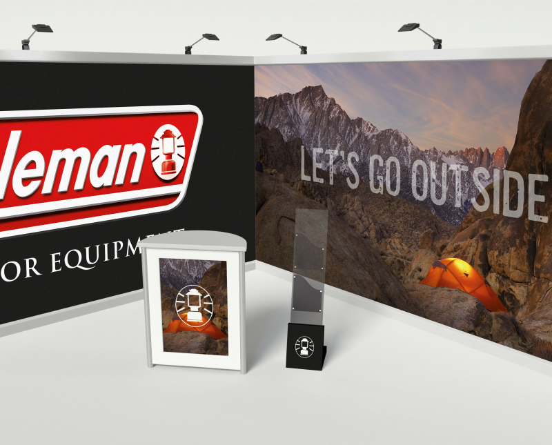
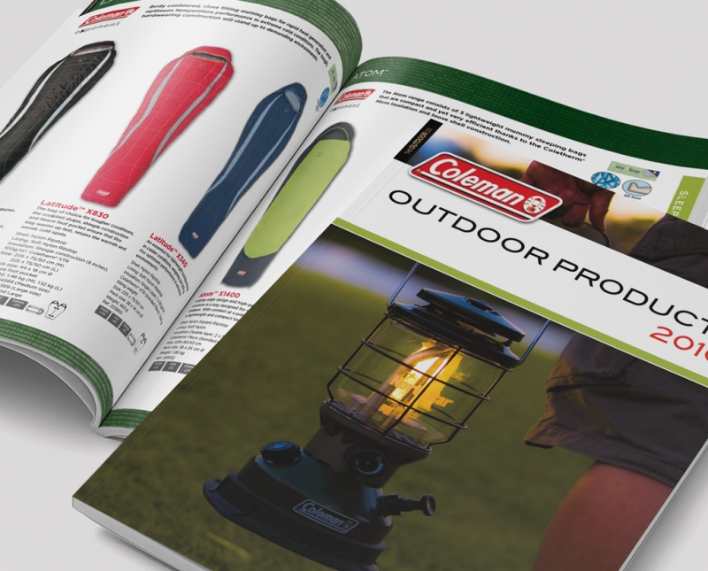
Alongside exhibitions, advertising and point-of-sale Coleman UK trusted us with their brochure design for many years. Inspiring photography, bold layout and benefit-led copy combined to make easy-to-use and well-received marketing material.
-
Bush Design
Producer & DJ, Ben Dubuisson, asked us to design a brand for his interiors business, Bush Design. Ben specialises in bar & restaurant design as well as domestic projects. Using a combination of mid century furniture and fittings with bespoke pieces he creates really individual and beautiful spaces. Ben wanted a 60’s feel to the mark and for it to have a versatility to be applied to various materials including burnt branding and etching on wood.


