Triple B
- Web
- Social
- Brand
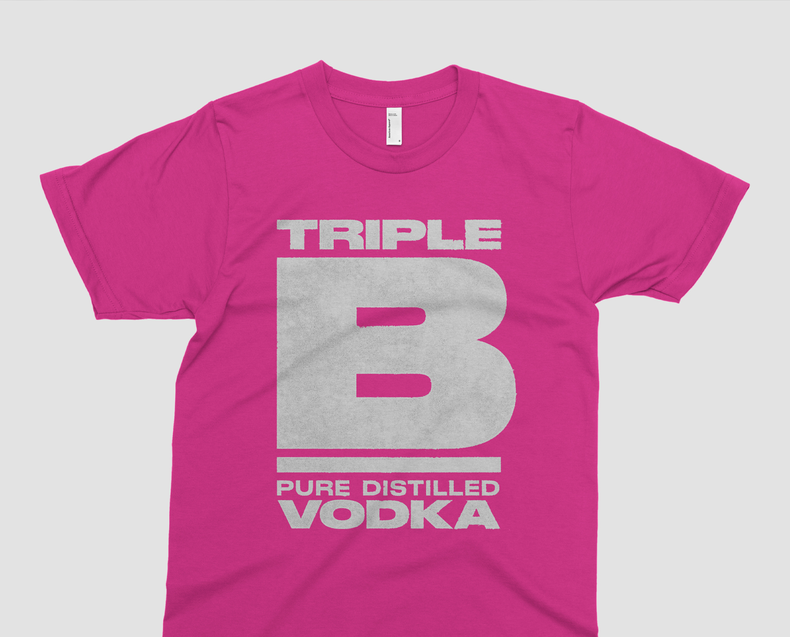
- Merchandise
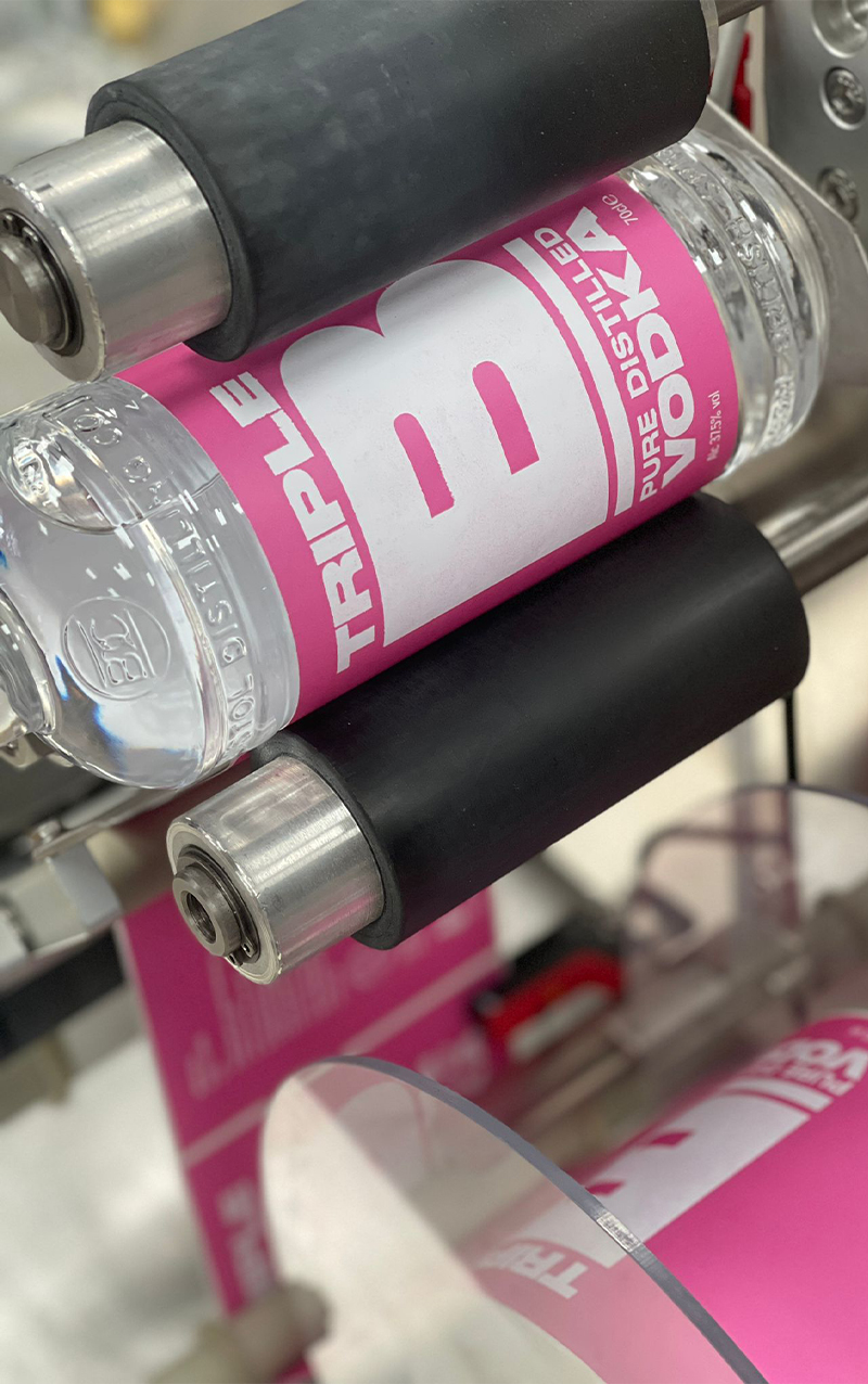
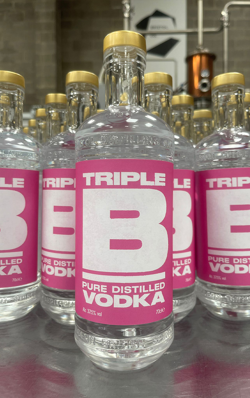
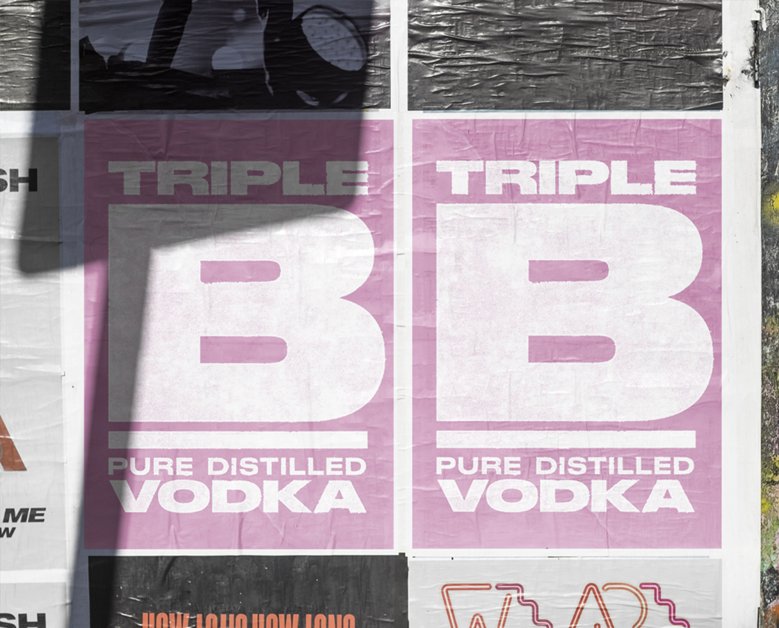
Bristol Distilling Co wanted a gritty, hard hitting vodka brand to add to their already successful range of spirits. Adopting an even bolder approach to this identity, we developed a typographic approach that does exactly what it says on the tin. The design has a letterpress feel – with rough edges and a ‘roller’ texture; an overall note of the hand-made! Topping things off with a fluorescent pink colour palette, Triple B really stands out amongst its rivals, with great uptake from bars and restaurants. The identity also lends itself perfectly to merchandise and social. No messing – it’s definitely vodka!
“Blu Inc know us. It makes the design process straight forward and even enjoyable. We have full confidence in their creativity and vision, and they always deliver exactly what we want.”
Jake Black Founder