-
Triple B case study
Bristol Distilling Co wanted a gritty, hard hitting vodka brand to add to their already successful range of spirits. Adopting an even bolder approach to this identity, we developed a typographic approach that does exactly what it says on the tin. The design has a letterpress feel – with rough edges and a ‘roller’ texture; an overall note of the hand-made! Topping things off with a fluorescent pink colour palette, Triple B really stands out amongst its rivals, with great uptake from bars and restaurants. The identity also lends itself perfectly to merchandise and social. No messing – it’s definitely vodka!
Sector: Web Social Brand Print Merchandise
-
Stump Brothers case study
Newly established, London-based tree stump removal experts, Stump Brothers, wanted a bold, no-nonsense brand that would set them apart in an ever-growing and increasingly competitive market. Stump Brothers are young, driven and have a great attitude – in what might be seen as a sector that traditionally doesn’t receive the design attention that it deserves, they know the value of a strong brand. The new identity has been rolled out over every inch of merchandise, livery, web and social. Knowing how to use your brand is a critical factor in its development – and Stump Brothers do this very well.
-
Black’s Double Barrel Whiskey case study
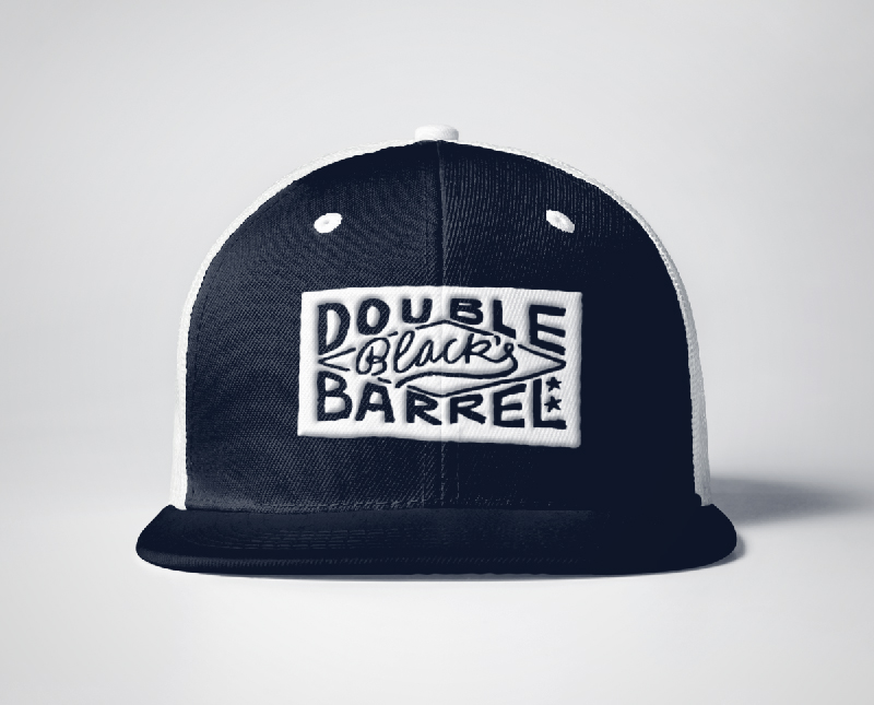
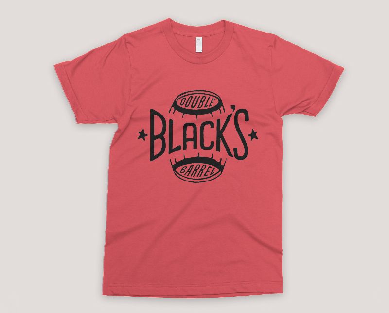
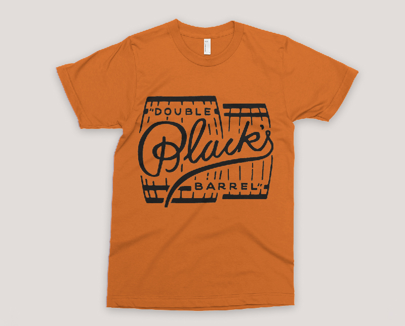
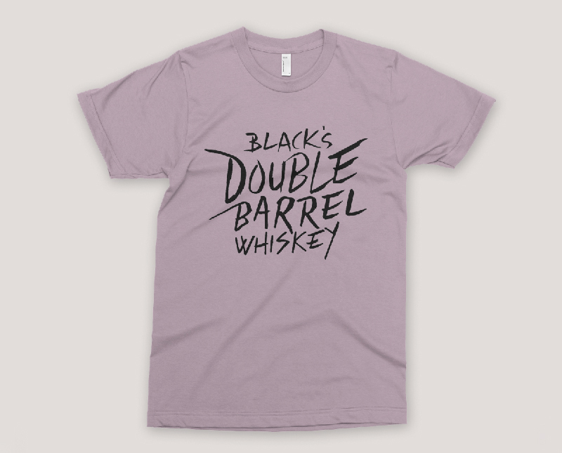
Bristol Distilling Co are making their very own rich and spicy whiskey. It’s maturing in a bunch of beautiful oak barrels, fresh from the US, at their distillery right now. Their range of gin and gin liqueurs, that we worked on, required a sharp, graphic approach, but their whiskey needed something more organic and earthy. The whiskey label still uses some crisp typography, but it employs a more sumptuous colour/foil pallet, combined with a subtle oak textured background. Alongside the label design, print and social media assets, we worked with good friend and life-long work associate David Abbott, to create a suite of illustrations to use across the brand and bring home the more hand-crafted aspect of the Bristol Distilling whiskey story. A dark cherry whiskey liqueur is also in initial design development – continuing the theme of deep, rich flavours matched up with a similar design tone.
Sector: Web Social Brand Print Merchandise
-
Triodos Bank case study
Sector: Web Social Brand Campaign Animation Print Illustration Exhibition Merchandise Signage Wayfinding Interior
-
77 Gin Liqueurs case study
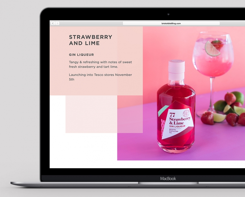
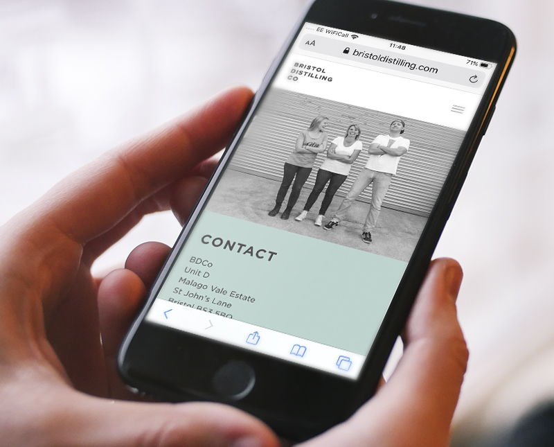
Bristol Distilling Co, having had success with Gin 77, developed a range of flavoured, lower ABV, gin liqueurs. We art-directed and designed a set of bottle labels and associated graphics, merchandise, advertising, social and web site updates. Interest from the big five grocers followed, with one listing.
2020 saw a liqueur redux (see below). The tone was to be more playful and Pop Art inspired with the labels incorporating bright, sharp and graphic fruit illustrations. The illustrations were used as stand-alone pieces for merchandise and social teasers. We also had the chance to create the ultimate mailer of bottles and flight case!
Sector: Web Social Brand Print Packaging Illustration Merchandise
-
Bristol Distilling Co. case study
Lorem ipsum dolor sit amet, consectetur adipiscing elit, sed do eiusmod tempor incididunt ut labore et dolore magna aliqua. Ut enim ad minim veniam, quis nostrud exercitation ullamco laboris nisi ut aliquip ex ea commodo consequat. Duis aute irure dolor in reprehenderit in voluptate velit esse cillum dolore eu fugiat nulla pariatur. Excepteur sint occaecat cupidatat non proident, sunt in culpa qui officia deserunt mollit anim id est laborum.
Sector: Web Social Brand Print Merchandise
-
Empire Fighting Chance case study
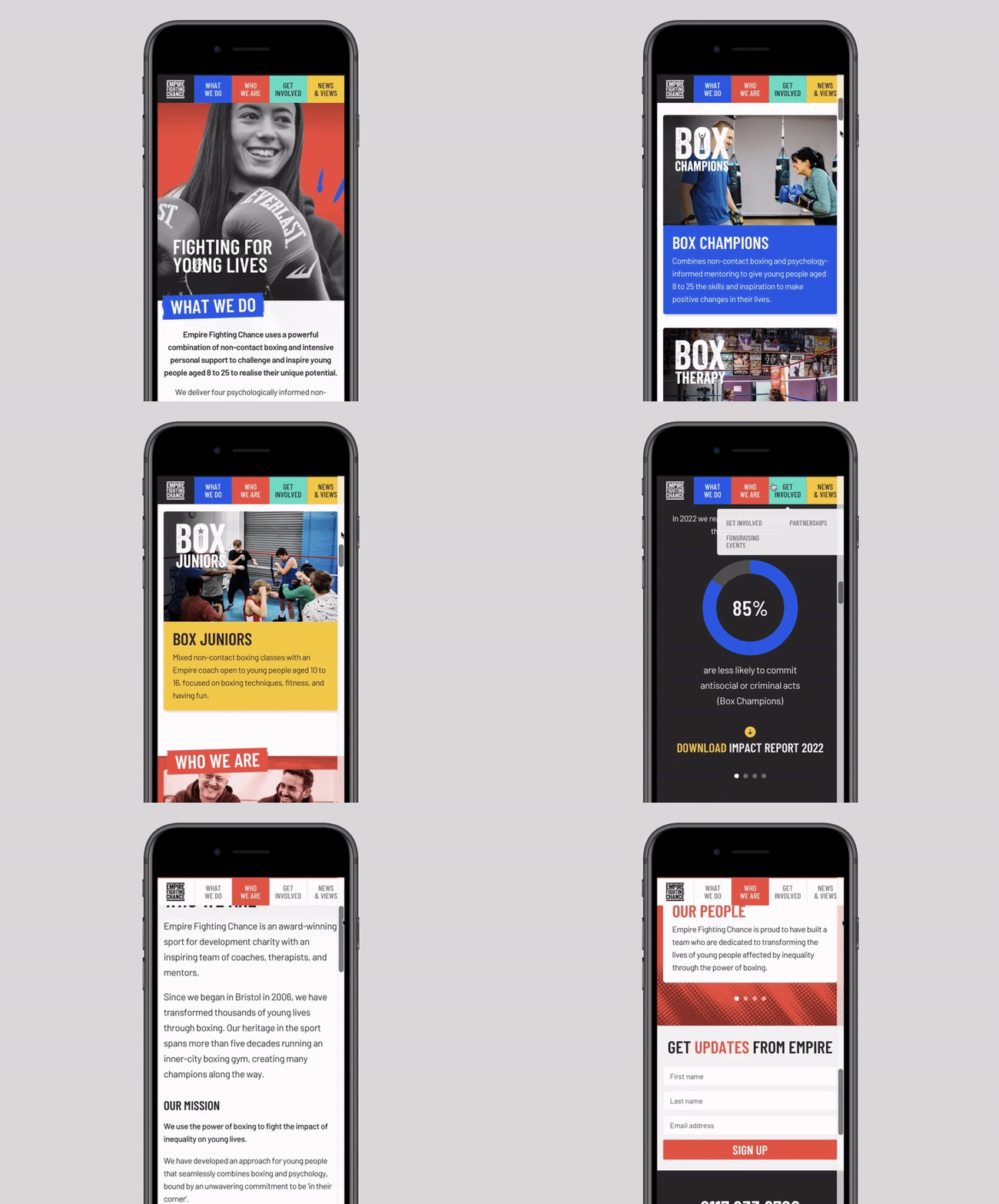
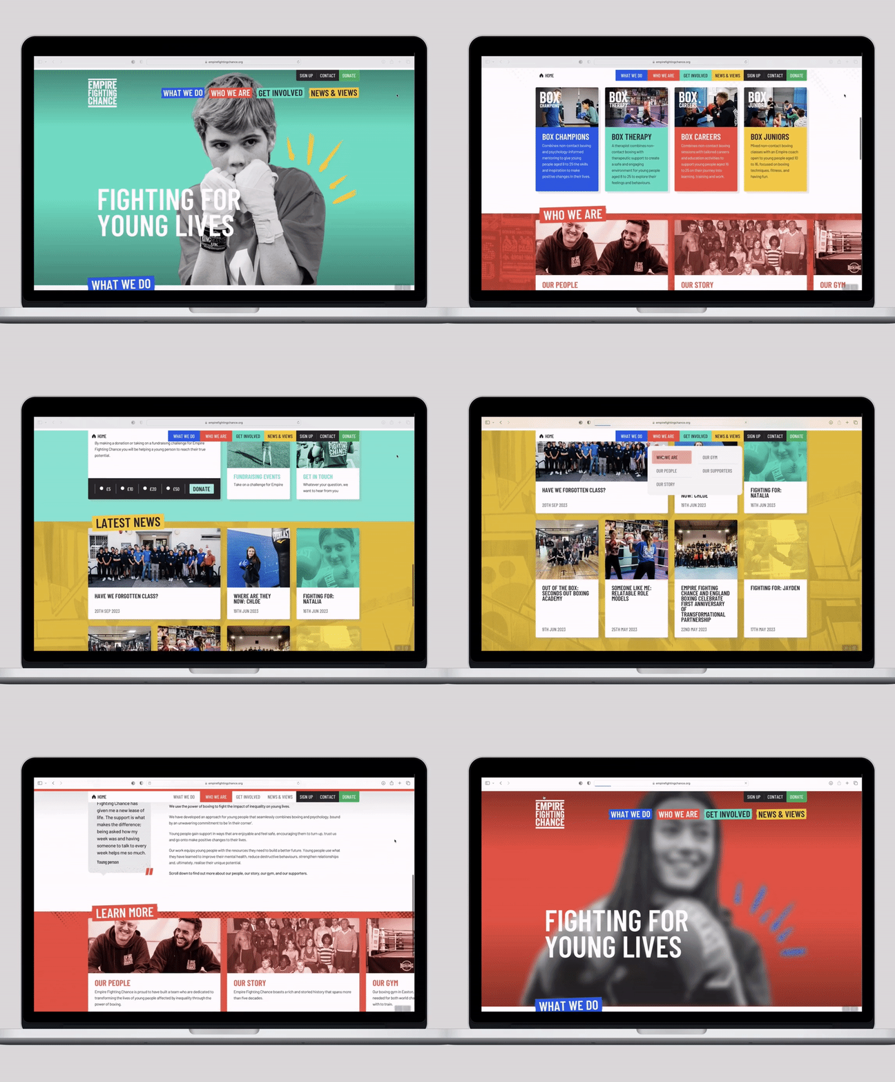
Empire Fighting Chance are a charity that tackle the impact of deprivation on the lives of young people, using a mix of non-contact boxing and intensive personal support. Involved from its inception, we created a bold brand, website, merchandise, and all aspects of design for print – from annual impact reports to large format. Their bold identity has helped Empire raise their profile and become a serious player in the highly competitive charity sector. Jamie Sanigar and team continue to go from strength to strength with their tireless dedication in helping disadvantaged young people across Bristol and the UK.
Sector: Web Social Brand Animation Print Exhibition Merchandise Livery Signage


