View all work
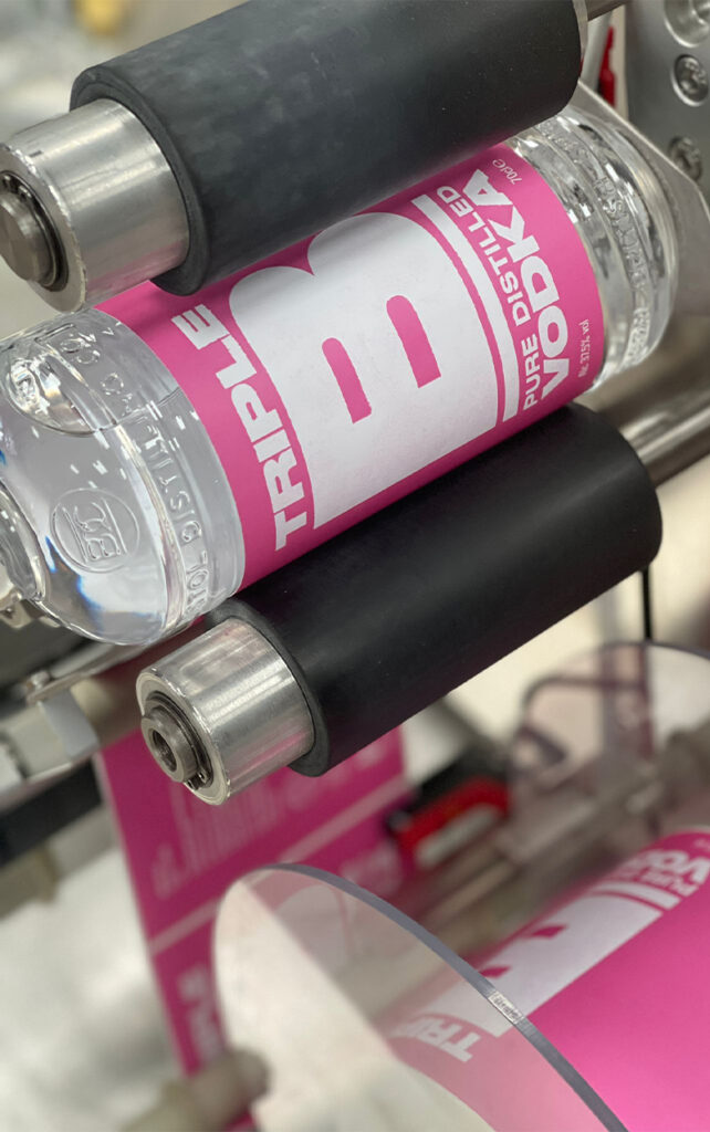
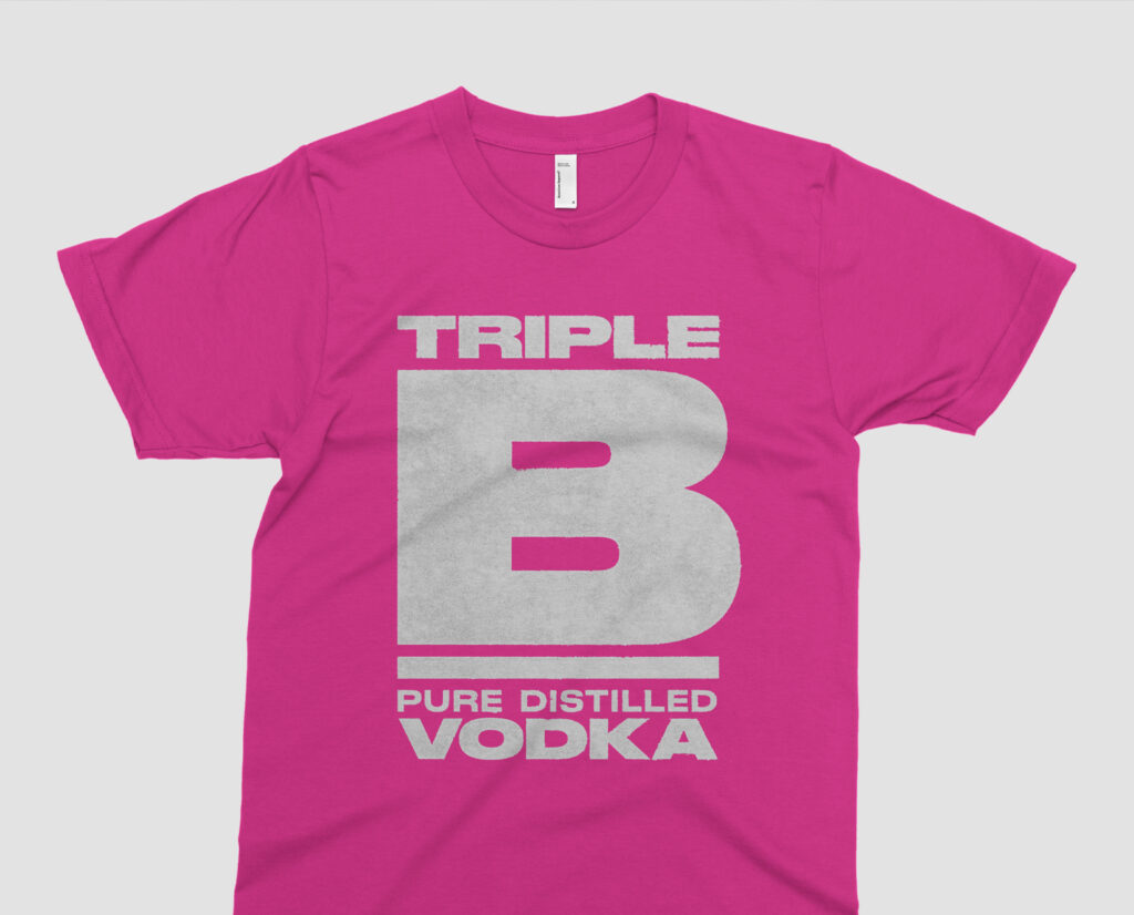
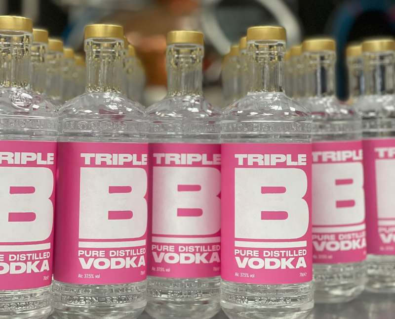
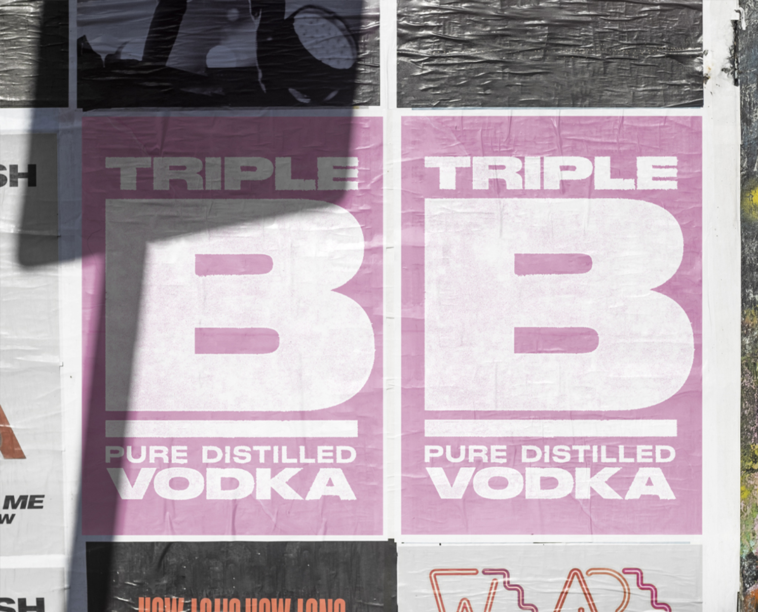
Triple B
Bristol Distilling Co wanted a gritty, hard hitting vodka brand to add to their already successful range of spirits. Adopting an even bolder approach to this identity, we developed a typographic approach that does exactly what it says on the tin. The design has a letterpress feel – with rough edges and a ‘roller’ texture; an overall note of the hand-made! Topping things off with a fluorescent pink colour palette, Triple B really stands out amongst its rivals, with great uptake from bars and restaurants. The identity also lends itself perfectly to merchandise and social. No messing – it’s definitely vodka!